Connektd
Going from 0 to 1 for a startup designed to connect career explorers and businesses.
B2C
B2B
Marketplace
0 to 1
Matching

Overview
From Concept to v1: Launching a Career Matching Platform
Connektd (now Kaie) is a matching platform that connects businesses with early-career talent to foster real-world experience and mentorship. After early success, the team was eager to build a v1 product to bring to market.
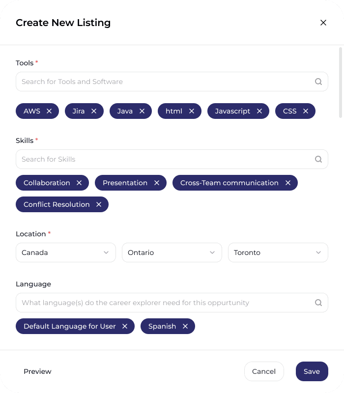
As the Product Design Explorer, I designed and tested key product flows—including Matching, Marketplace, Messaging, and Listings — increasing active users by 10x after launch.
Team
PM, Founder
Role
Product Designer
Duration
July - October 2024
(3.5 months)
Background
Focusing the project on the core differentiator: the matching experience
After initial success with their product, a matching service that connects businesses with career explorers to foster practical work experience and mentorship, they were eager to build a v1 product to bring to the market.
I was tasked with designing the core features: Matching experience, Marketplace, Messaging, and Listings. I decided to focus on the matching experience as it was the core differentiator.

Ideation
Ideating on the Matching Algorithm
The core differentiator of the product was the matching experience, instead of sifting through hundreds or potential candidates or postings, Connektd would instead give you the best matches.
Criterias and weights were finetuned for optimal results, new categories were added based on the information displayed in our UI.
Under NDA
Iteration
Determining What's Important
Worked on determining which information was crucial for business to include and explorers to view. Used to fine-tune our sorting algorithm.

Iteration
How to Present Matches
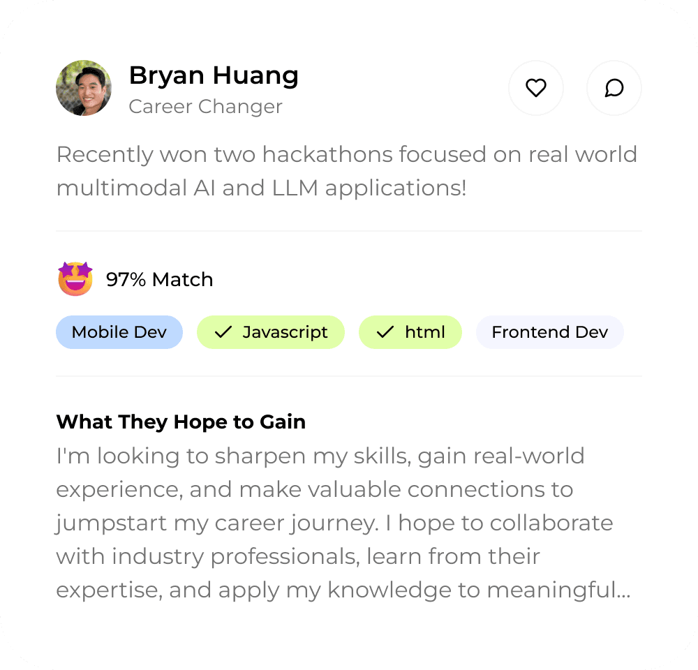
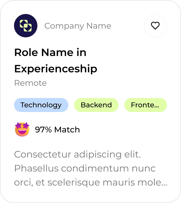
While designing the matching experience and marketplace, I explored numerous explorations of card designs. To pull together all these ideas into a cohesive whole. I finalized on a 2 size card system. These were then used across the platform.
Explorations


Finalized 2 Card System

Challenges
Refining the Matching Experience: Enhancing Career Explorer Differentiation with Limited Experience Data
Since the platform was focused on career explorers or students with limited applicable experience, we needed a different way for businesses to differentiate between them.
After speaking with businesses stakeholders and the founder we decided to:
Prioritize personality
de-prioritize information could cause bias
Ideation
To differentiate explorers with minimal experience, we decided to go with a message-first approach. Allowing seamless communication on the platform for users to create connections as individuals rather than employee and employer. .
Challenges
Cutting features to save costs, what can we actually build?
When the company secured a new deal with universities to adopt our platform, we faced a tight timeline to launch. This required us to carefully balance feature value with development time to prioritize what would be most impactful in version 1.
Features cut
Complex Messaging
Matching tags
User reviews
What I convinced them to keep
Messaging
Less complex tags
Connektd's Take
Future Proofing
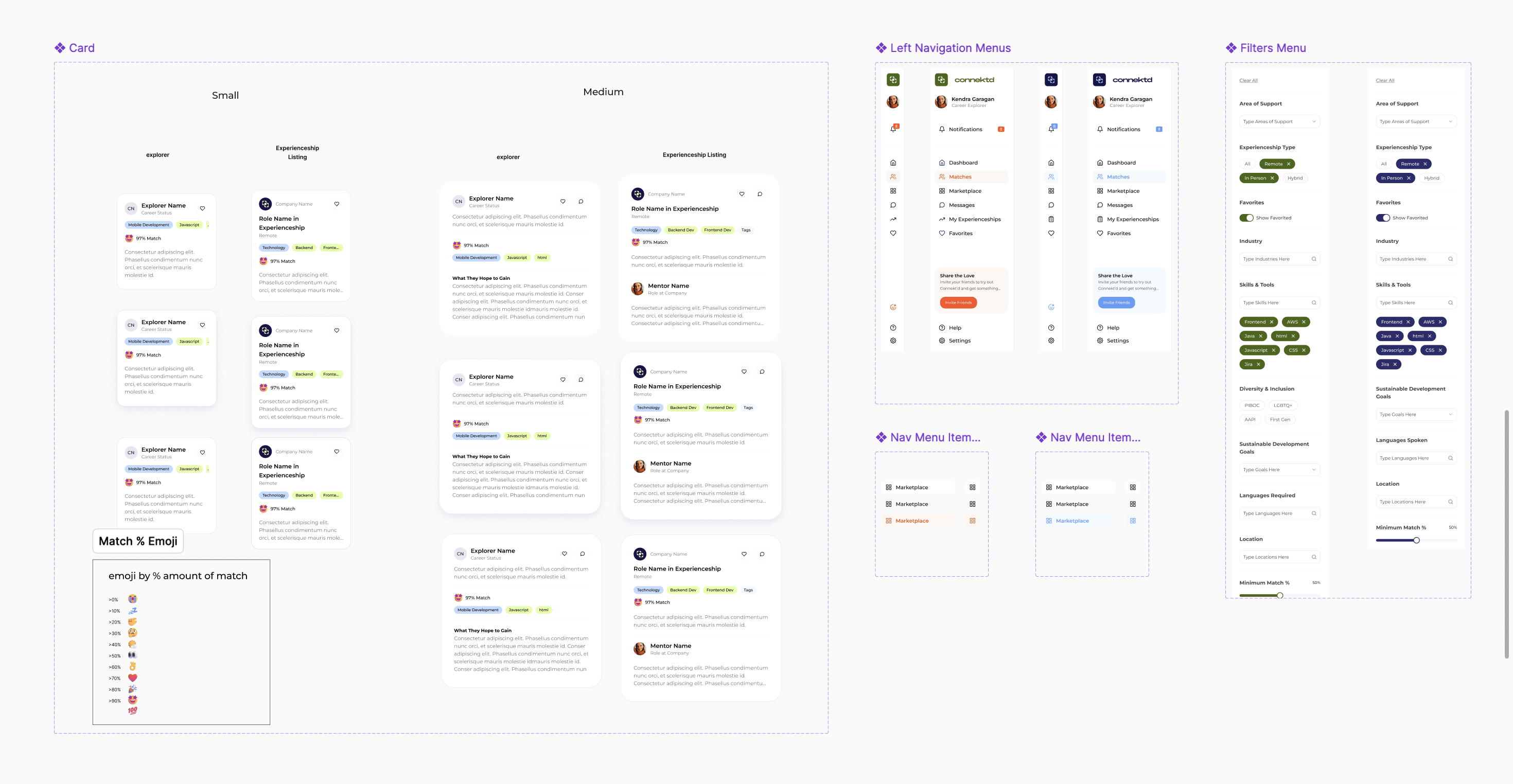
Building a robust design system
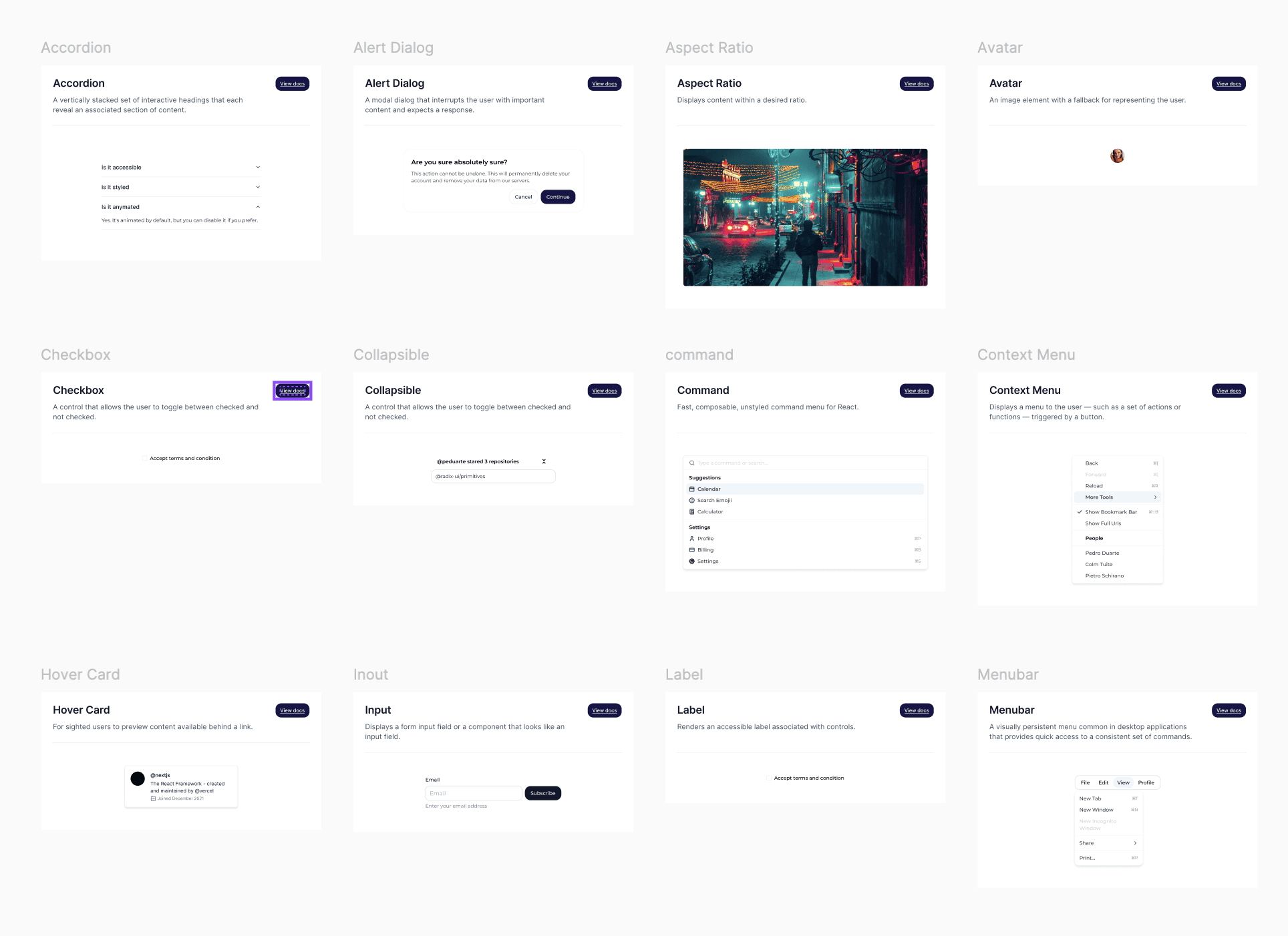
When I joined, the startup used a loose collection of colors, fonts, and a handful of components while building out the product. To speed up design and to ensure cohesion, I navigated them to a preset component library and customized it to fit what they had envisioned.


Challenges
Designing for 2 core user groups
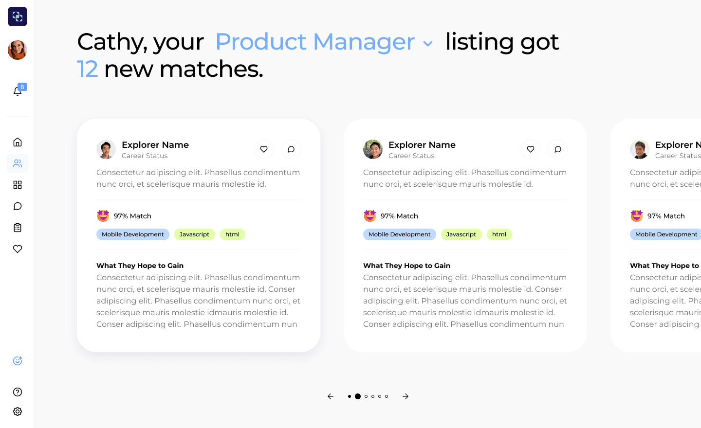
Our product serves two distinct user groups—career explorers and businesses—each with unique needs. I maintained a consistent design across the product while tailoring specific features to meet the requirements of each group.
Designing for Career Explorers

Designing for Businesses Owners
Prototype & Testing
Prototype tested well but users were confused between ‘matches’ and ‘marketplace’
The concept tested well, however all participants had one complaint…
Key Findings:
4 out of 5 users were confused between the marketplace vs matches tab and their differences.
3 out of 5 users were confused by copy and would like more info on filter options.
Most users like to navigate through the notification first, for both accepting offers and on launch.
Confusion Between 'Matches' and 'Marketplace' Tab

Solution
Small changes for big impact
While I wanted to address some concerns from the usability testing, we were on a tight schedule and wanted to prevent major changes to the screens we’ve designed. To navigate these challenges, I proposed a small change to the business marketplace, asked the team to focus on copy, and documented other changes for v2.
Before

users were confused between the marketplace vs matches tab and their differences due to this header
After
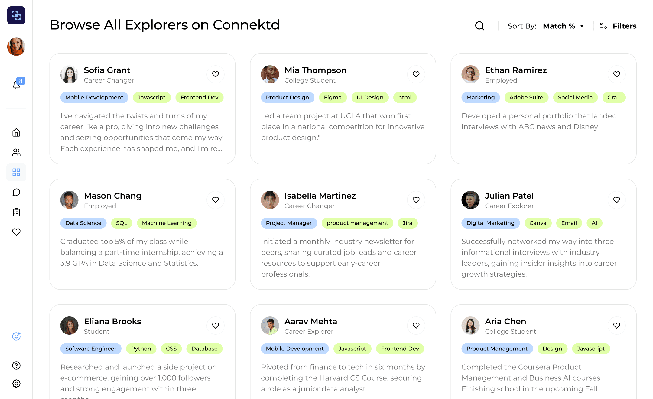
Changed copy to disassociate the 'matching' and 'marketplace' tab
Relocated Listing selection under filters tab
Conclusion
Impact
10x Increase
In active users after launch!
