Corbu.ai
Redefining Onboarding Experiences and AI Interactions.
Web App
Generative AI
Startup
B2B
Product Design
TEAM
Founder, Engineers x3
ROLE
Product Designer
DURATION
January - June 2024
OVERVIEW
What is Corbu?
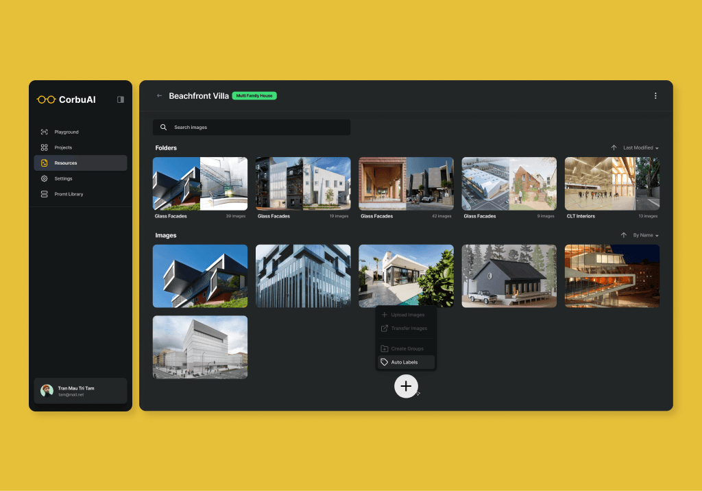
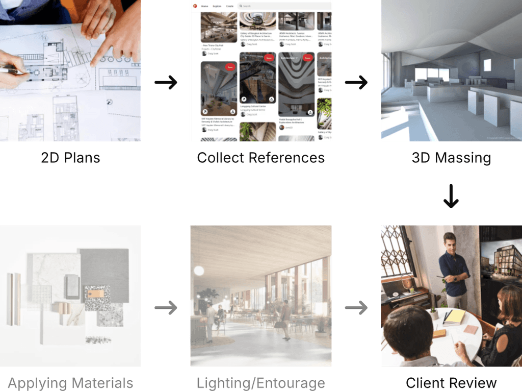
Corbu is a startup building a generative rendering product for architects and spatial designers. It addresses the time-consuming nature of traditional rendering workflows.
By mimicking architects' workflows and leveraging precedent images, Corbu accelerates the creation of polished renderings, offering architects the control lacking in current image generation tools.
The Problem
Why are new users struggling with onboarding?
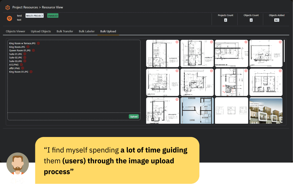
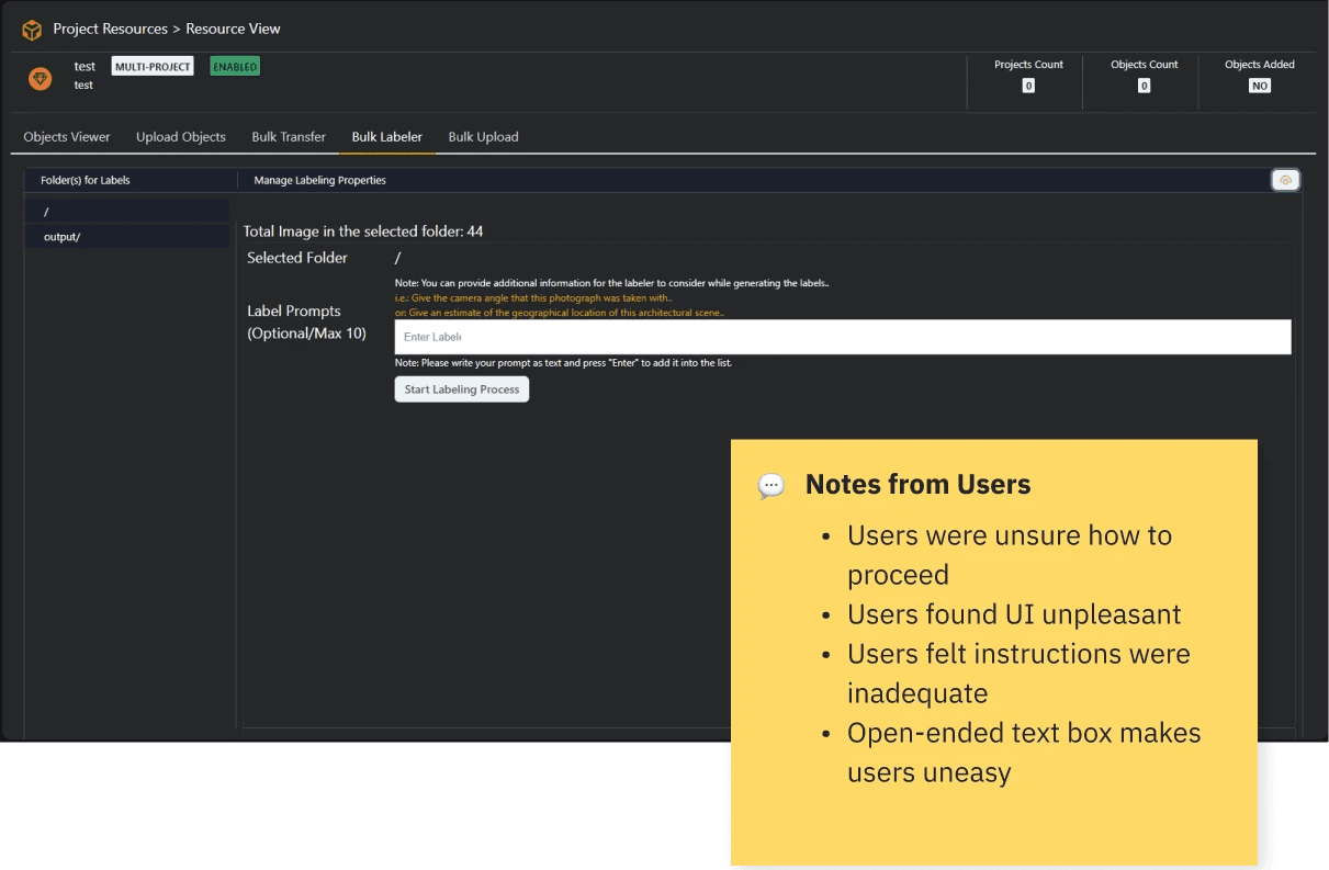
Architects found the initial image upload process confusing and lacked guidance on how to utilize the auto-label feature.
Revising User Flows
Improving the Onboarding Experience
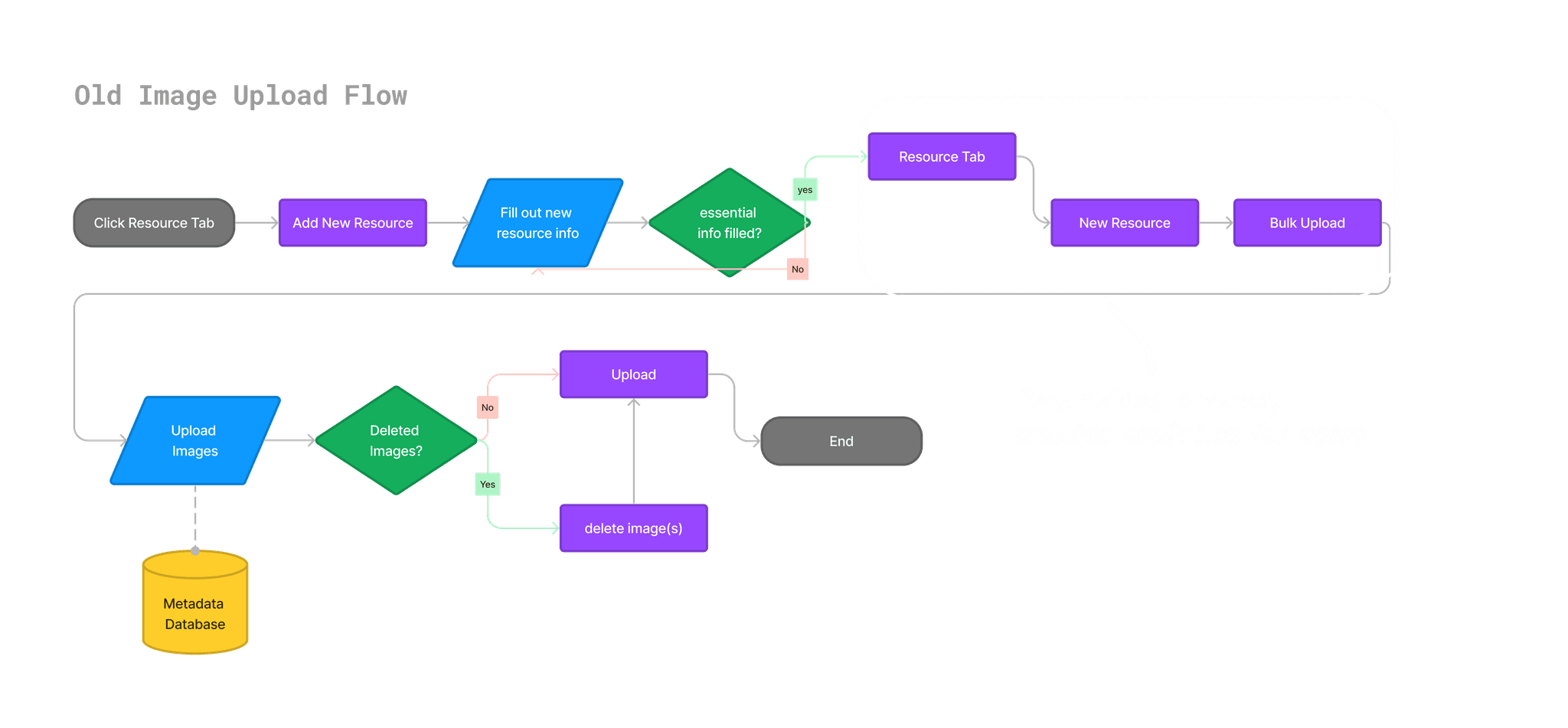
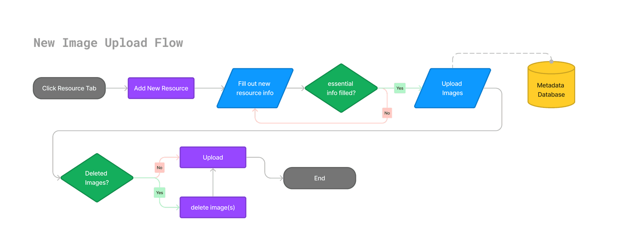
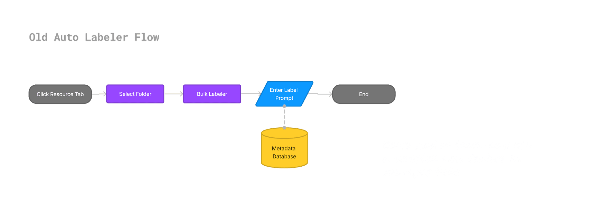
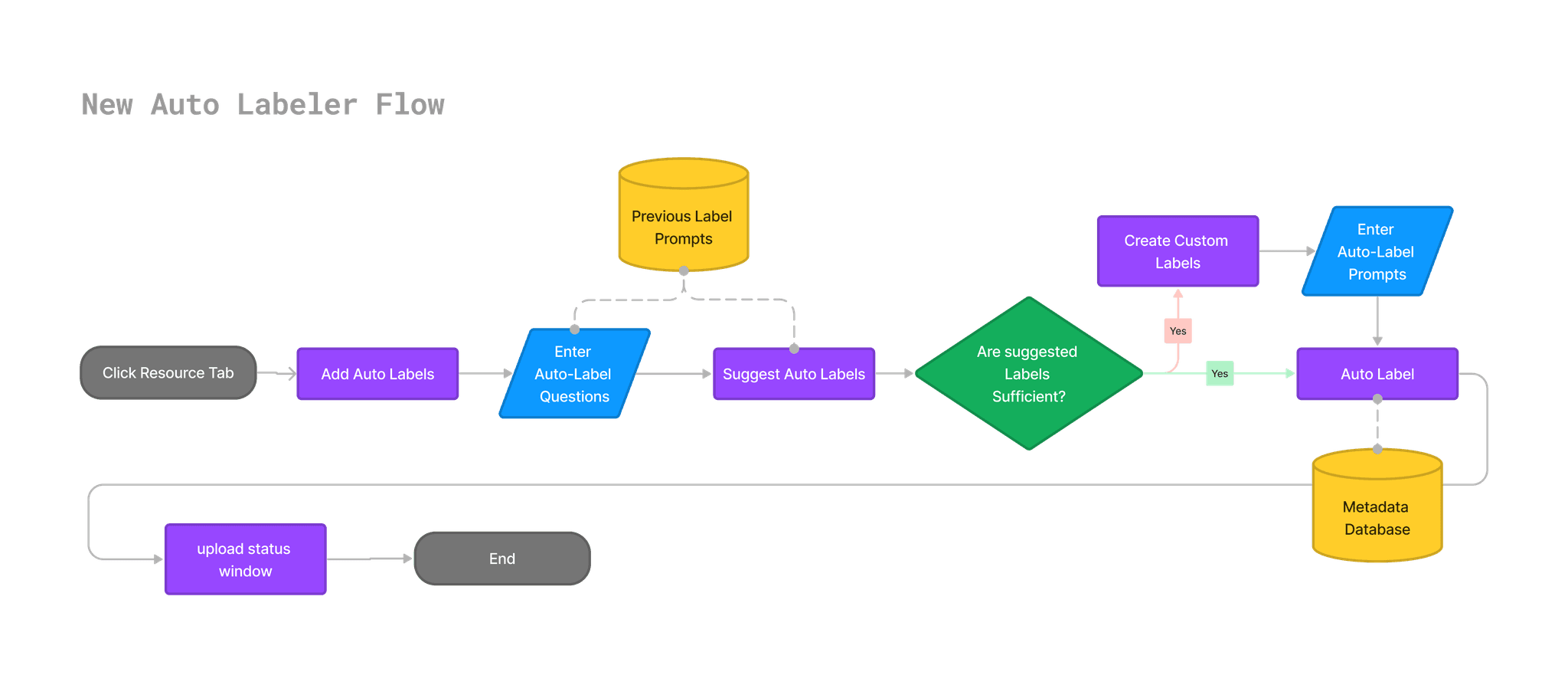
Revised existing user flows issues found during heuristic evaluation with insights from precedent analysis.
Streamlined the image upload flow by eliminating unnecessary screens, and provided more guidance to users when using the auto label feature.
Changes
Eliminated redundant screens in the image upload flow
Asked background info on why users are creating auto labels.
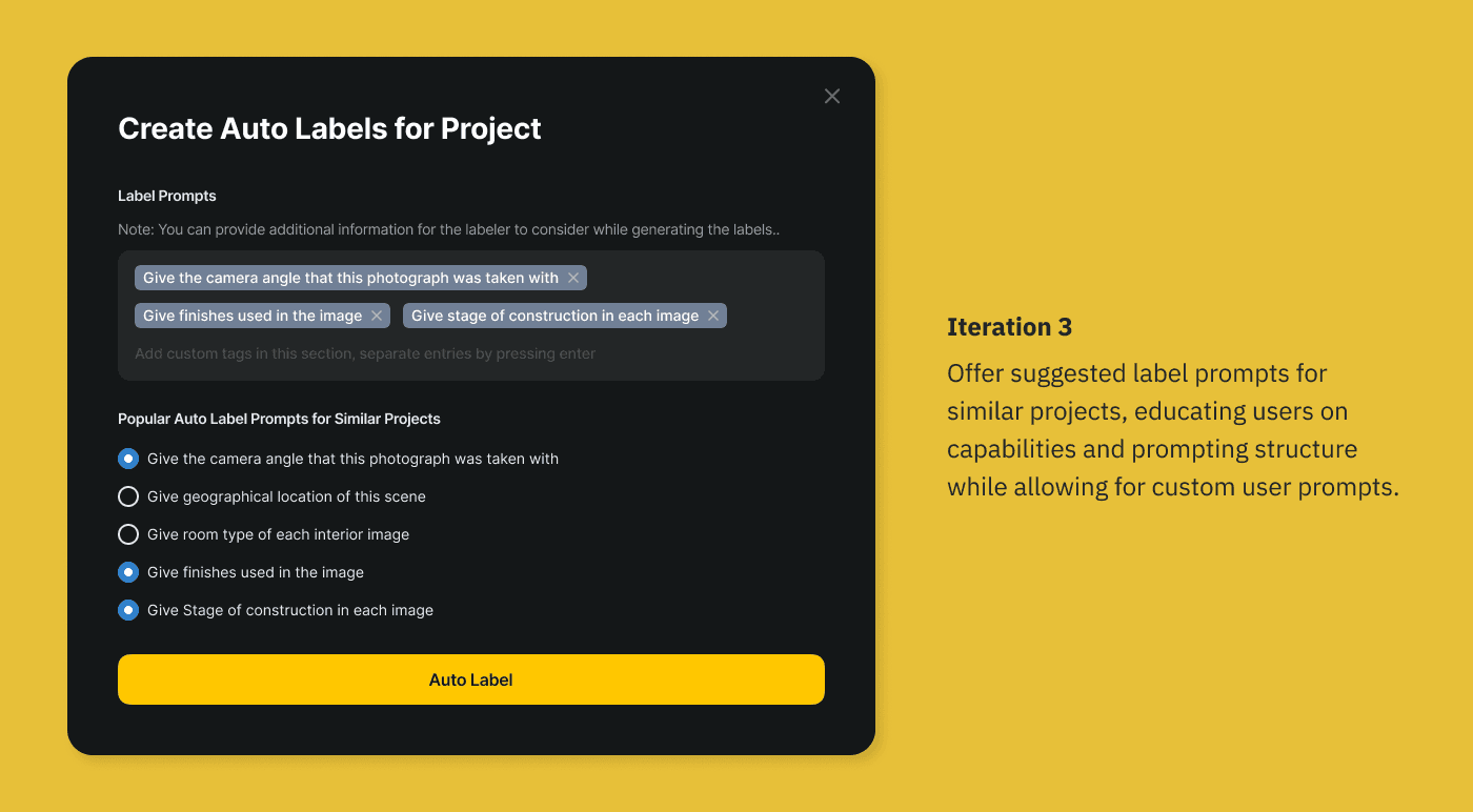
Educated users on auto label capabilities through suggestions.
Offer more control to users by breaking complex task down into multiple steps.
Iterating on Design
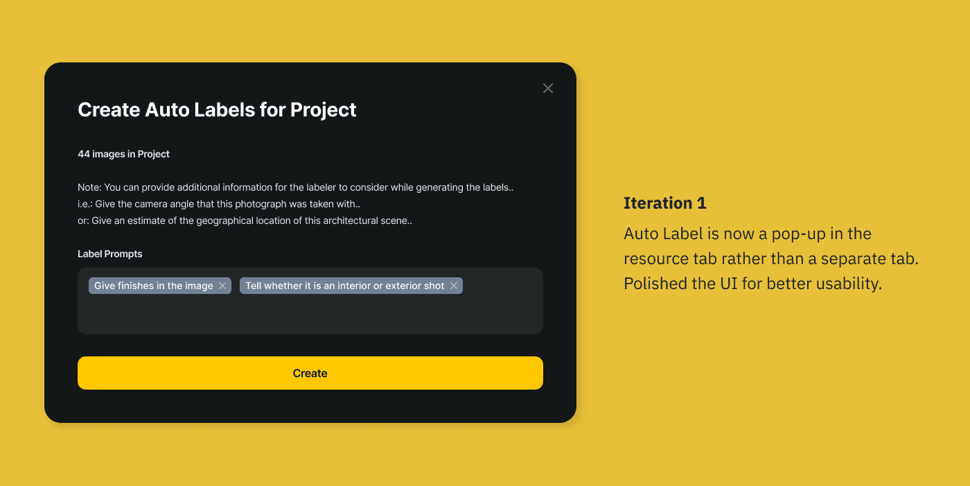
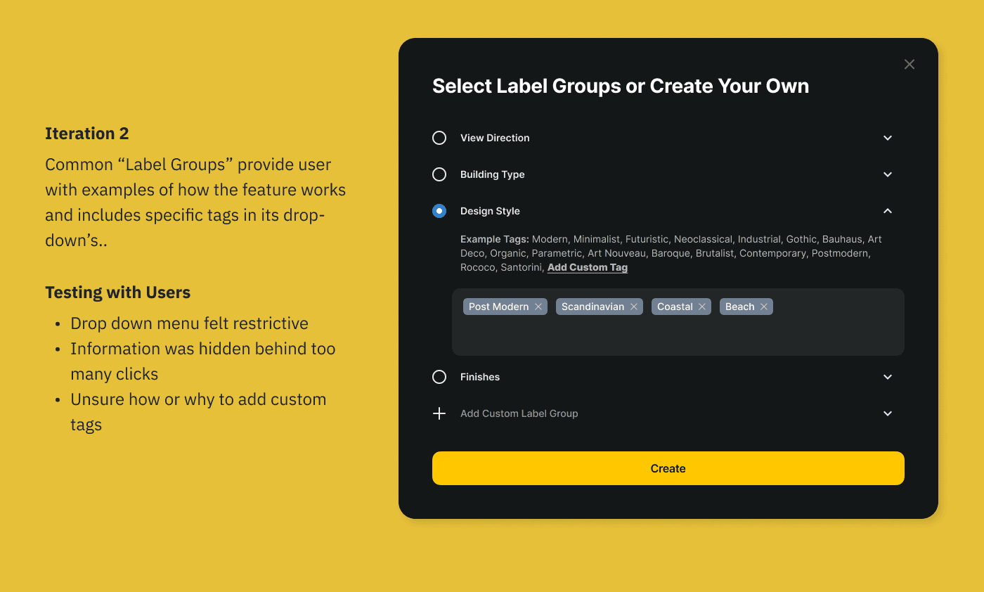
Iterated on the Auto Label feature with input from users.
Soltuions
Anticipating User Needs During Initial File Upload
Guiding Users Through The Auto Label Feature
RESULTS
How Did We Do?
70%
42%
Learnings?
Iterate Fast and Iterate Often
Speed is the name of the game in a startup environment. It is important to iterate as often as possible, making mistakes at every pass and incrementally improving the product!
