TEAM
Me - Product Designer
Victor Tran - Product Designer
PLATFORM
Web Extension, Chatbot, AI Interface
TOOLS USED
Figma, FigJam, Google Forms, Google Meets, Adobe Suite, Pitch
DURATION
Dec, 1, 2023 - Dec, 11, 2023
(10 Days | 50 Hours Total)
OVERVIEW
What is Schola
Schola is an AI powered research assistant spawned from a 10 day AI + UX Design challenge backed by Stratminds VC & Design Buddies.
The Prompt
Though AI tools are on the rise, the current trend sees users dwindle off after initial adoption. The competition wants designers to investigate how enhanced UX design can significantly improve the overall experience of various AI systems.
OUR PITCH
Mission
Read our full deck here!
Problems
Why are current AI tools insufficient?
01
02
03
Solutions
What is the solution and How does it help?
01
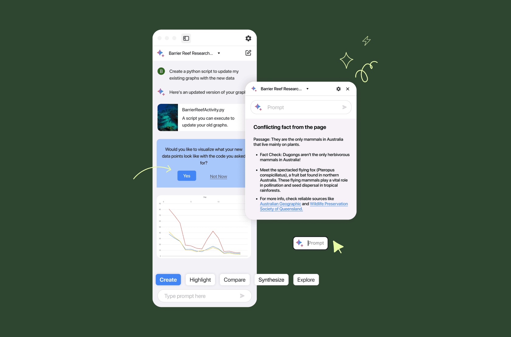
Guided by action verbs.
Creates clarity and offers shortcuts
02
Proactive Interactions
Serendipity and ease of use
03
Real-time validation
Reduce time needed to fact check
Solution #1
Schola enables users to understand what they can do via action verbs.
These key words will guide users to optimize their workflows by providing with each shortcut. By providing a framework for our users - they can more easily understand and utilize the best features of AI innovations with less friction.

Solution #2
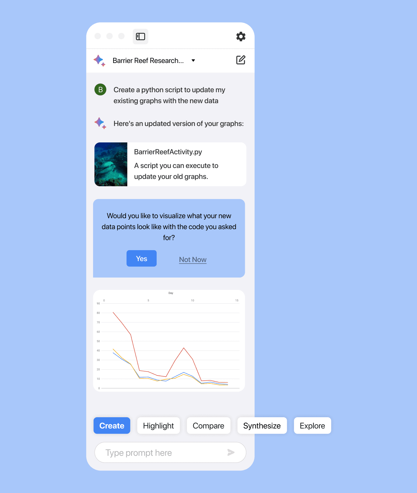
Schola prompts users with proactive interactions to reduce the friction of use.
Traditional AI chatbots require user input to begin a request, creating friction of use. Schola flips the dynamic, sometimes prompting users first to improve the research experience.
Schola can prompt users under a variety of circumstances and uses distinct UI elements to make interactions as seamless as possible.

Solution #3
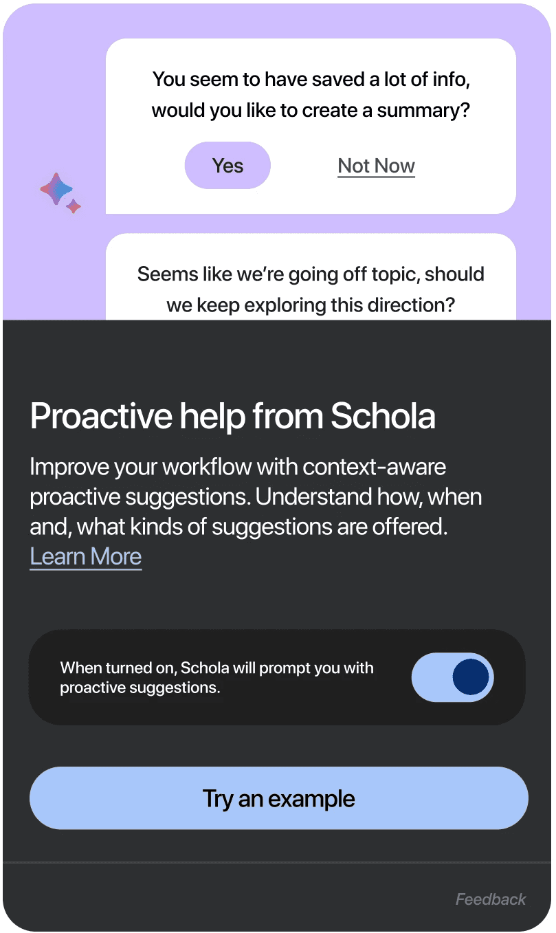
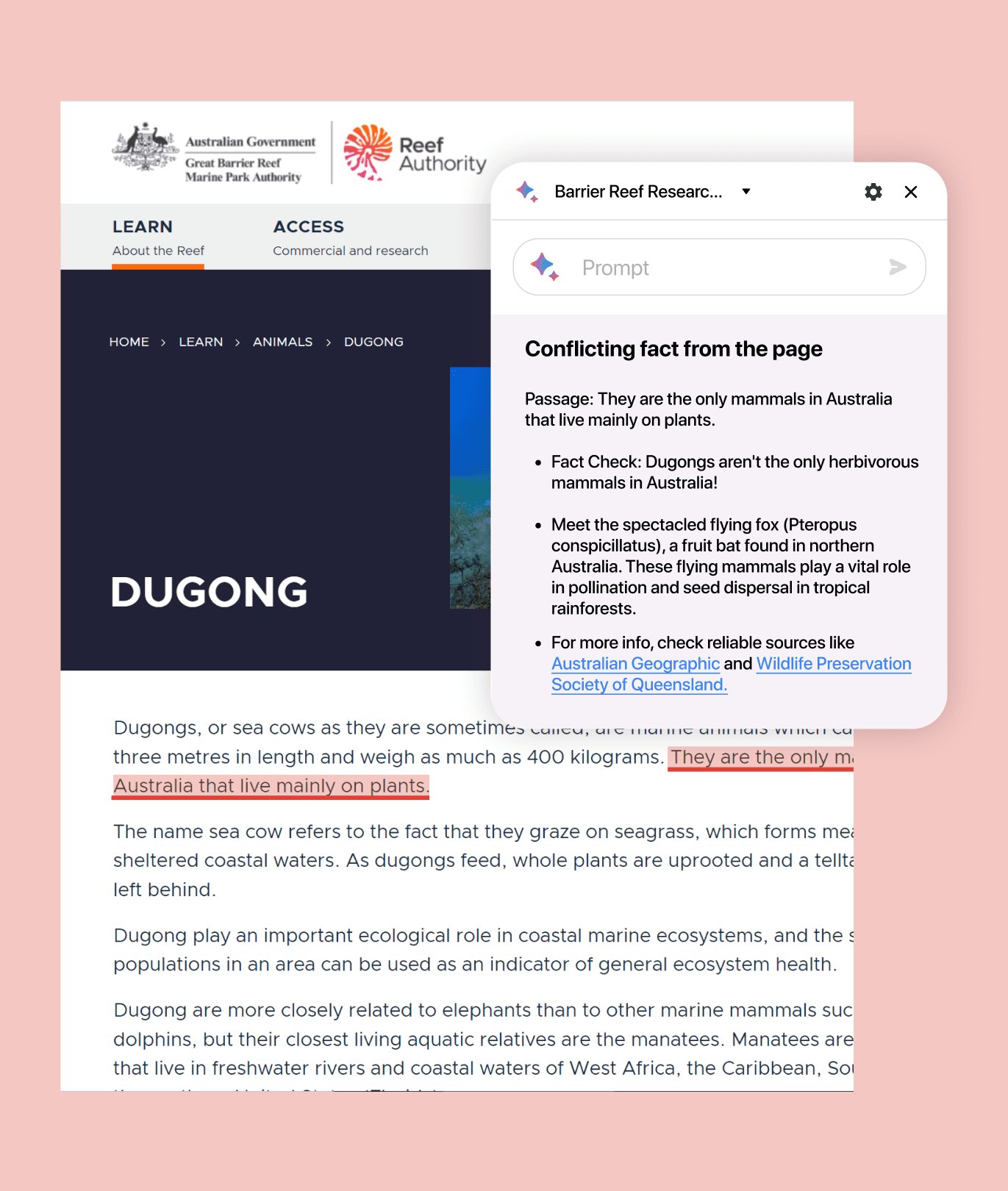
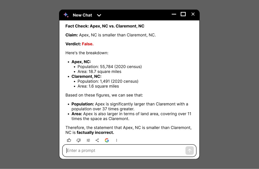
Schola validates information in real time to protect users from misinformation.
The web is full of information, but not all information is good. Schola filters out the noise with real-time information validation. It also provides evidence of its findings for user validation.
Schola highlights important information and provides context to back up its claims. Users can interact further with Schola for more exploration.

Our Design Journey
explore
We wanted to see how people are currently using AI and where we can create a significant impact.
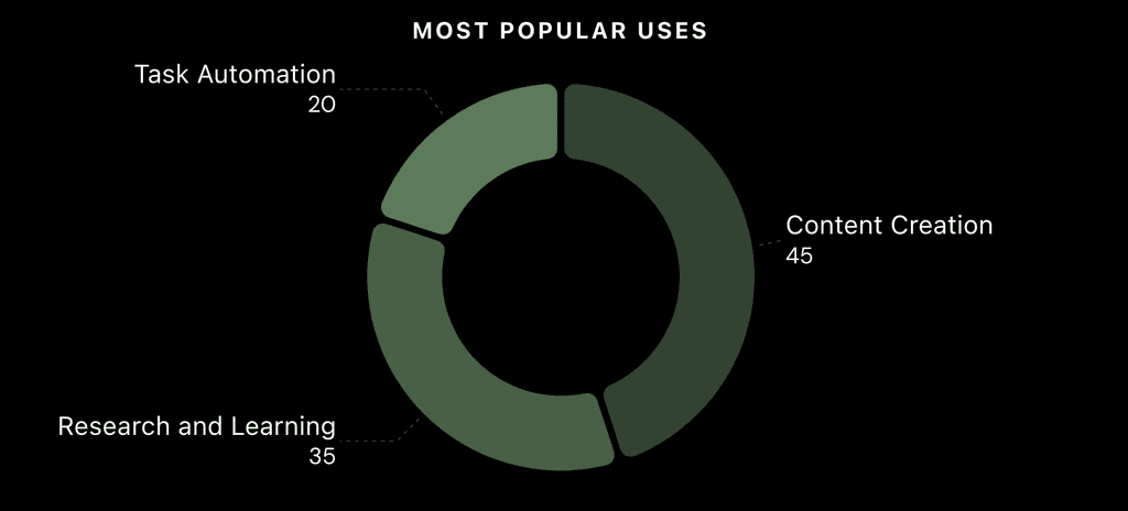
More people are utilizing AI tools in workflows.
7
63%
61%
focus
During our exploration, we converged on core UX problems in AI we wanted to tackle:
- Lack of Proactivity in AI - Limited user understanding in AI capabilities - Poor integration into current workflows
To narrow down the scope, we chose to focus on an AI research assistant that would also tackle these common AI UX problems.
research
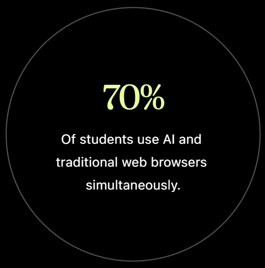
How are students using AI chat bots to gather information?
research
Common AI UX Problems
01
Framing Prompts is Hard
Users find it difficult to explicitly state all the constraints of their query. Conversations with well-defined goals start without proper framing.
02
Users lack vocabulary
AI Prompt = the Visible Part of the User’s Information Need. The user lacks the vocabulary or knowledge necessary to articulate requests.
03
Friction/ user effort*
The user effort needed to begin interactions is perceived to be greater than doing the task themselves.
04
Lacks Context
Many current AI interfaces lack sufficient support for uploading large amounts of contextual information into the prompts.
Source: NN Group, user interviews*
research
Where we sit in the Market
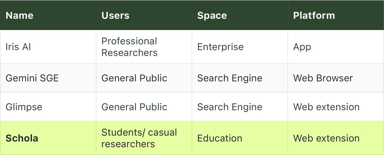
Notable competitors include Iris AI and the newly unveiled Gemini SGE. However, Schola is aimed toward a more casual audience compared to professional researches. We selected a web extension for seamless integration into user workflows focused on browser based research.
Problem Statement
ideate
We brainstormed solutions for prevalent AI UX issues within the context of our research assistant.
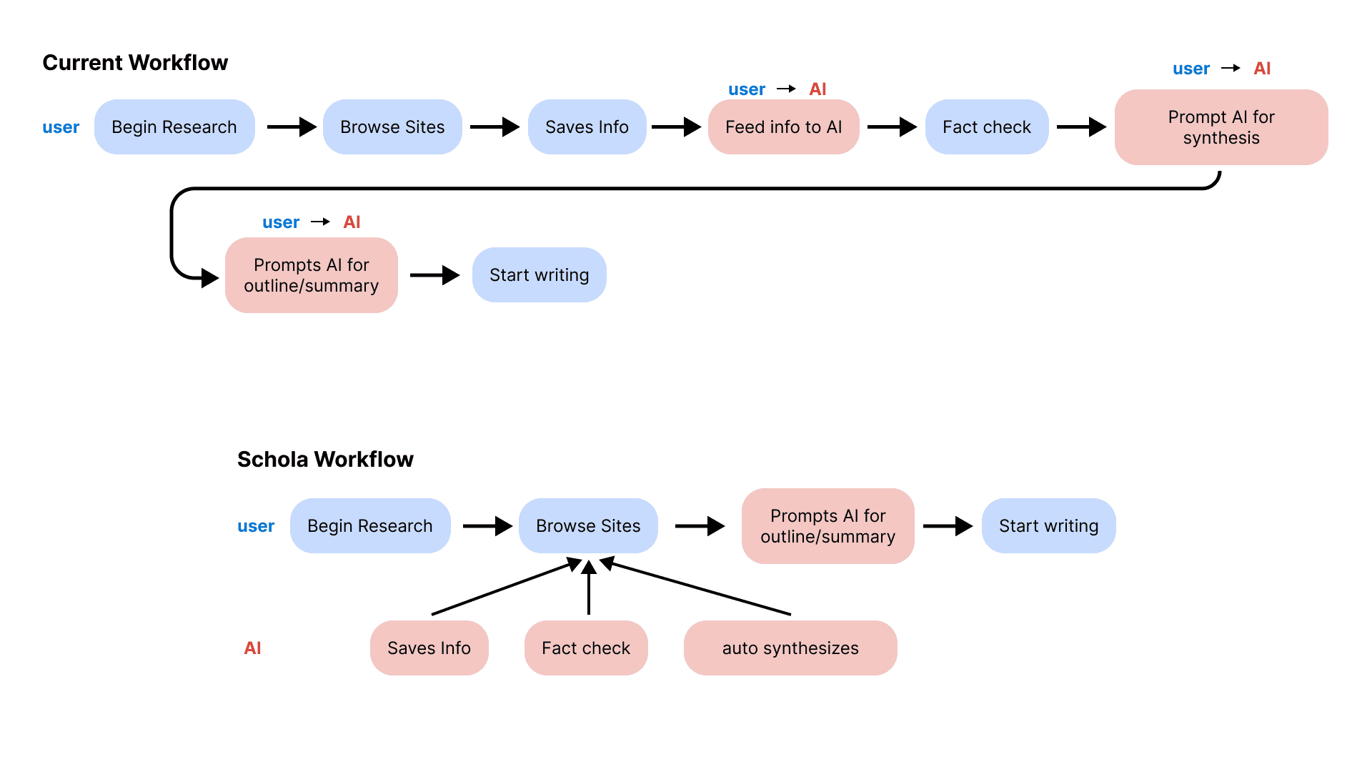
Leveraging our problem statement and insights from limited user interviews, we visually mapped the current research workflow involving AI, identifying opportunities to enhance the user experience.
ideate
Users and AI work in tangent instead of in sequence.
Current workflows with AI are cumbersome and require users to context switch to prompt AI and receive information. We propose a more seamless in-web experience.
Iterate

Iteration 1
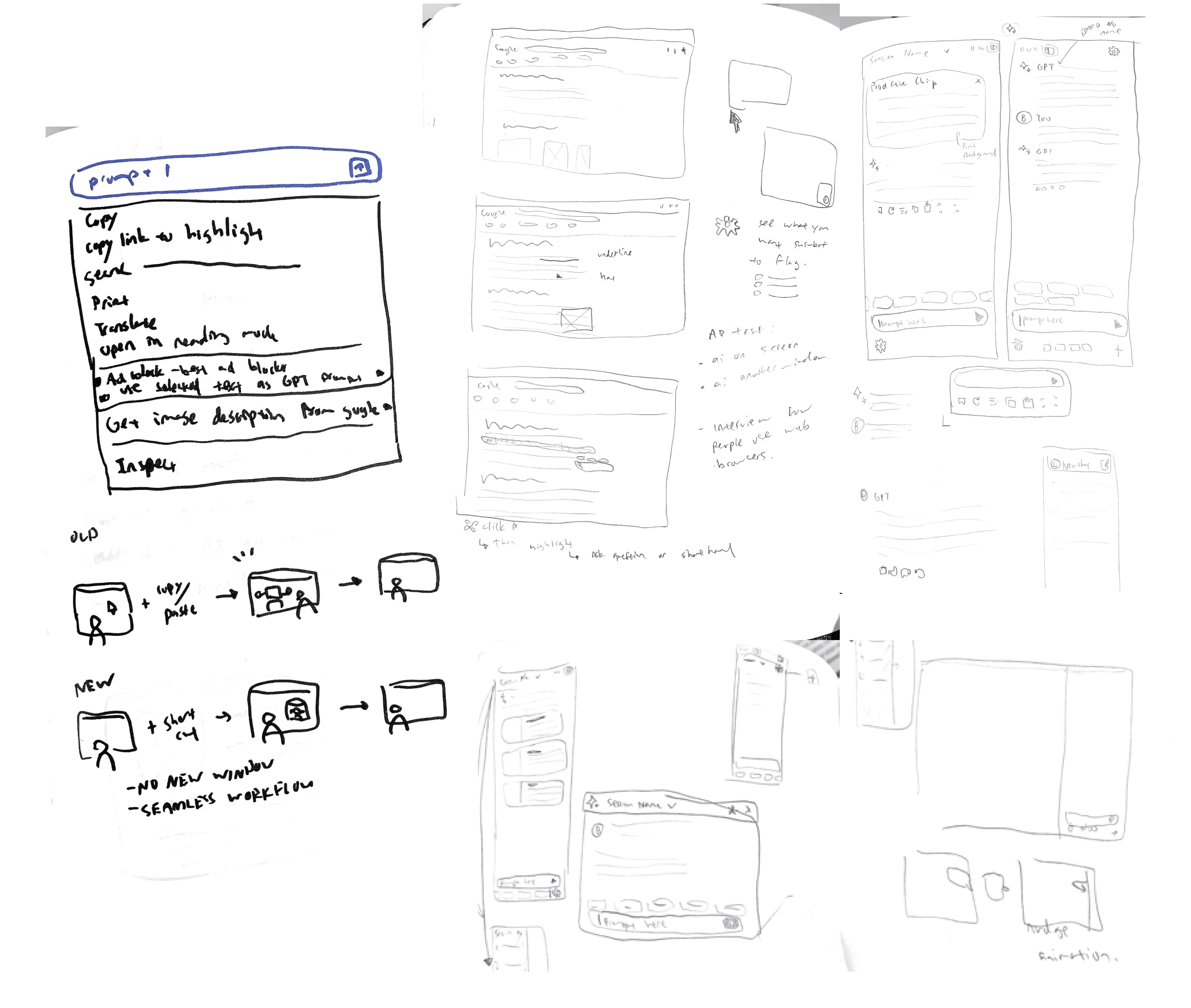
We started first with a simple idea of accessing your AI assistant on your existing web page to reduce friction.
Iteration 2
Adopting traditional chat bot interface as a pop-up to display for information.

Iteration 3
Settled on a flexible system of an adjustable sidebar and pop-up windows to best integrate into existing user workflows.
Feasability
How would we build this?
Leveraging Existing Infastructure
We use Google Gemini Pro, a language model developed by Google DeepMind.
Market-Ready Chrome Extensions
Provides a readily accessible platform, and allows for a faster and wider user adoption.
Takeaways
Through this fast paced competition, we learned how important it is to narrow down the problem space you are trying to solve fast to save more time on iterating solutions.
Without defined users and goals you can't start empathizing!
🙌 Huge thanks to STRATMINDS and Design Buddies for hosting this competition and nominating us, and to my partner Victor!

