ROLE
Just Me!
Product Designer
PLATFORM
Mobile, Website, E-commerce
TOOLS USED
Figma, FigJam, Google Forms, Google Meets, Discord, SurveySwap
DURATION
December 2022 - January 2023
(4 Weeks | 80 Hours Total)
OVERVIEW
What is DogChow?
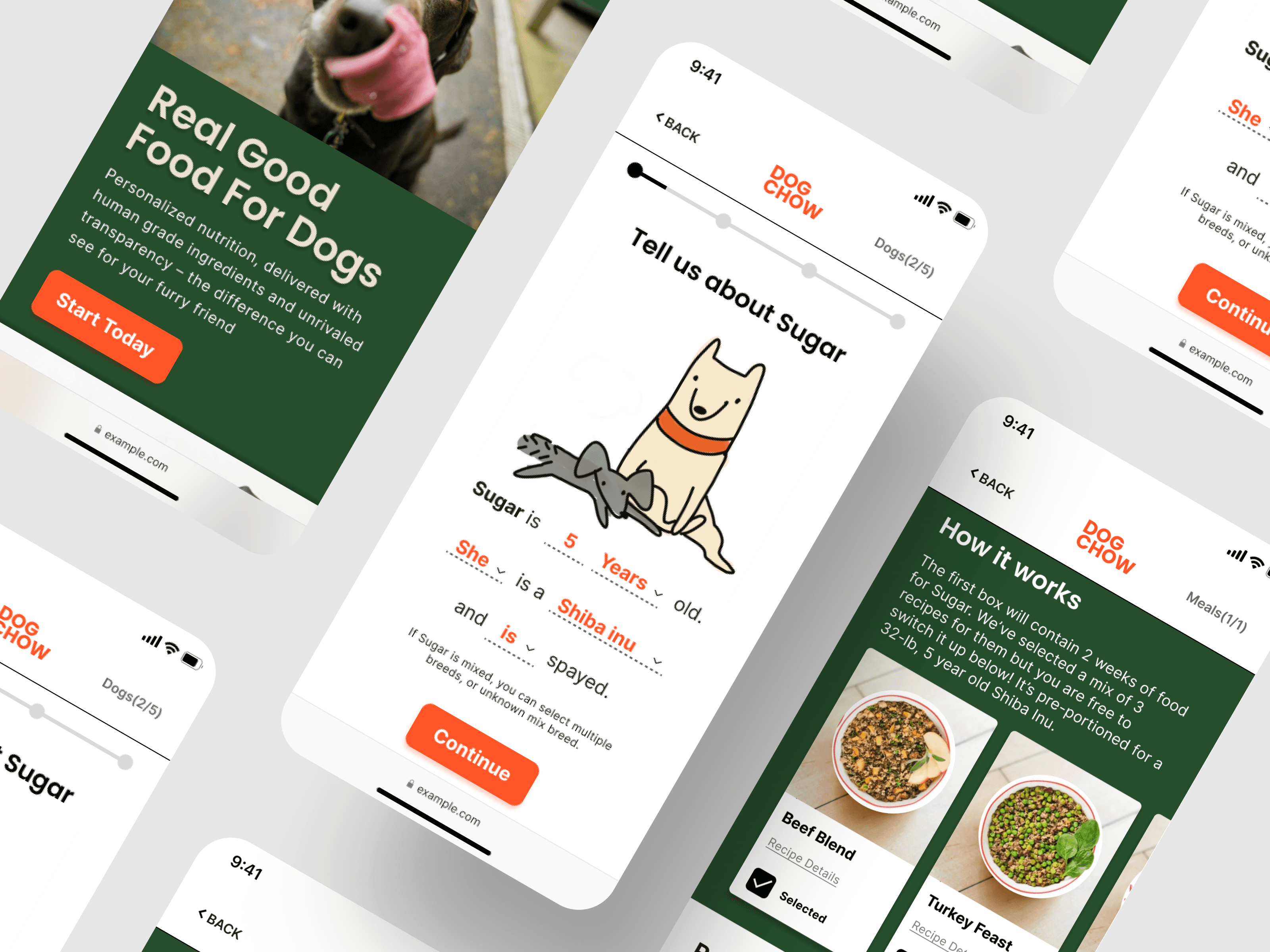
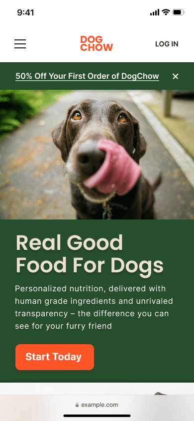
DogChow is an e-commerce subscription dog food product that aims to solve existing problems in its market space. It was done as a personal project as part of my UX course work.
Problem
Quality dog food options are expensive and non-transparent. Comparing multiple options induces anxiety.
Goal
Deliver customized nutrition to every dog with zero hassle.
SOLUTION
Conversational Survey
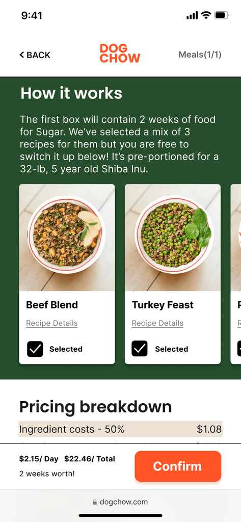
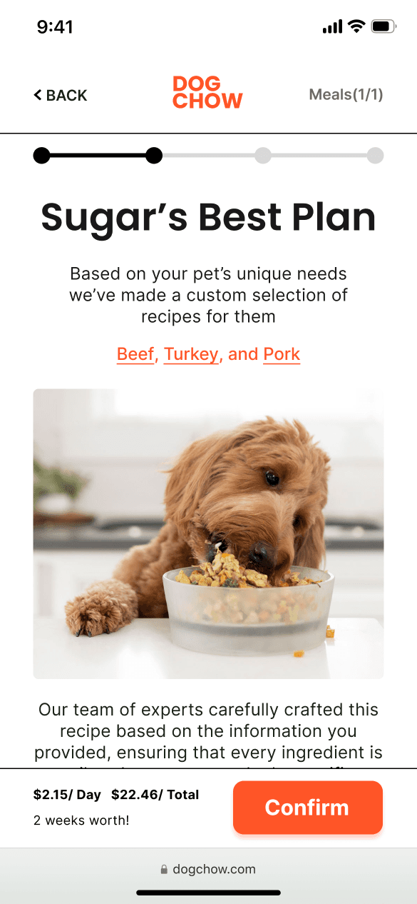
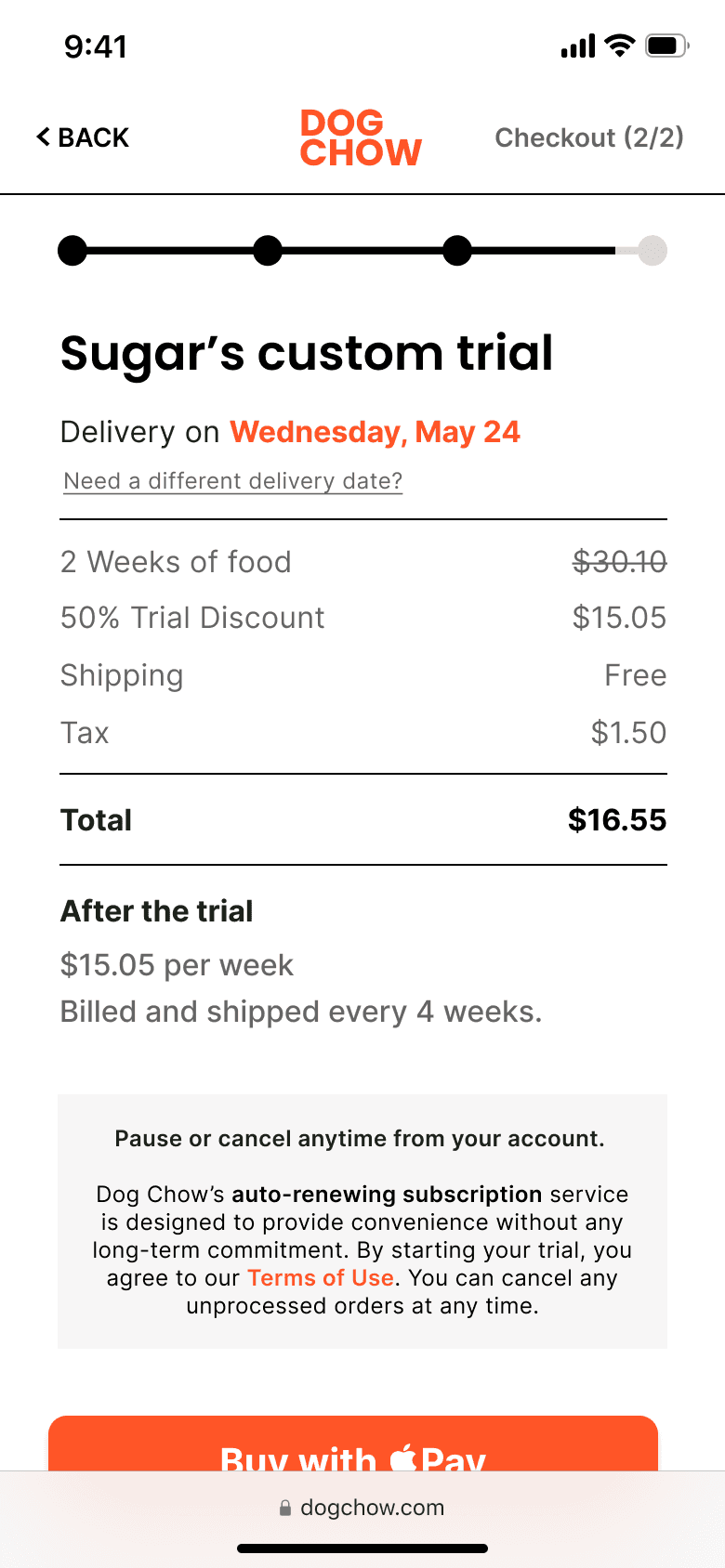
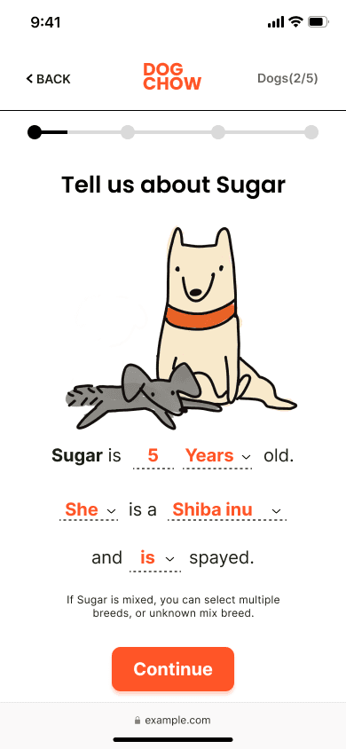
After ideating and learning from our competitors, we came up with the concept of utilizing a survey to bypass where users felt most frustrated in their journey: comparing ingredients and filling out checkout information.
In the survey, we lead users through each step with a friendly, chat-like approach, making it a breeze to complete while keeping things easy on the brain.
The Design Process
User Research
Methodology
During the research phase of the project, I conducted user interviews to build new personas to inform the design. Additionally, I conducted secondary research through consumer spending reports and online reviews. I referenced these findings throughout the entire design process. Initially, the research included the purchasing habits of all age groups for pet food before I shifted my focus to millennial professionals.
Findings
The primary user group identified is professional millennials who have pets but do not have kids. busy users crave the best food to improve pet health but require a convenient option. Users want more customization options than are presently available. Users are willing to pay more for the service.
pain points
What Frustrated the Users
1. Too many choices
Users find it difficult to differentiate between different pet food recipes.
2. Non-transparent
Even in high-end pet foods, users find it hard to find information on what the product was made of.
3. Customizations
Existing options lack the ability to be customized to best suit each dog’s needs.
4. Time
Working adults are too busy to spend time on their own meal prep much less their pets!
USER PERSONA
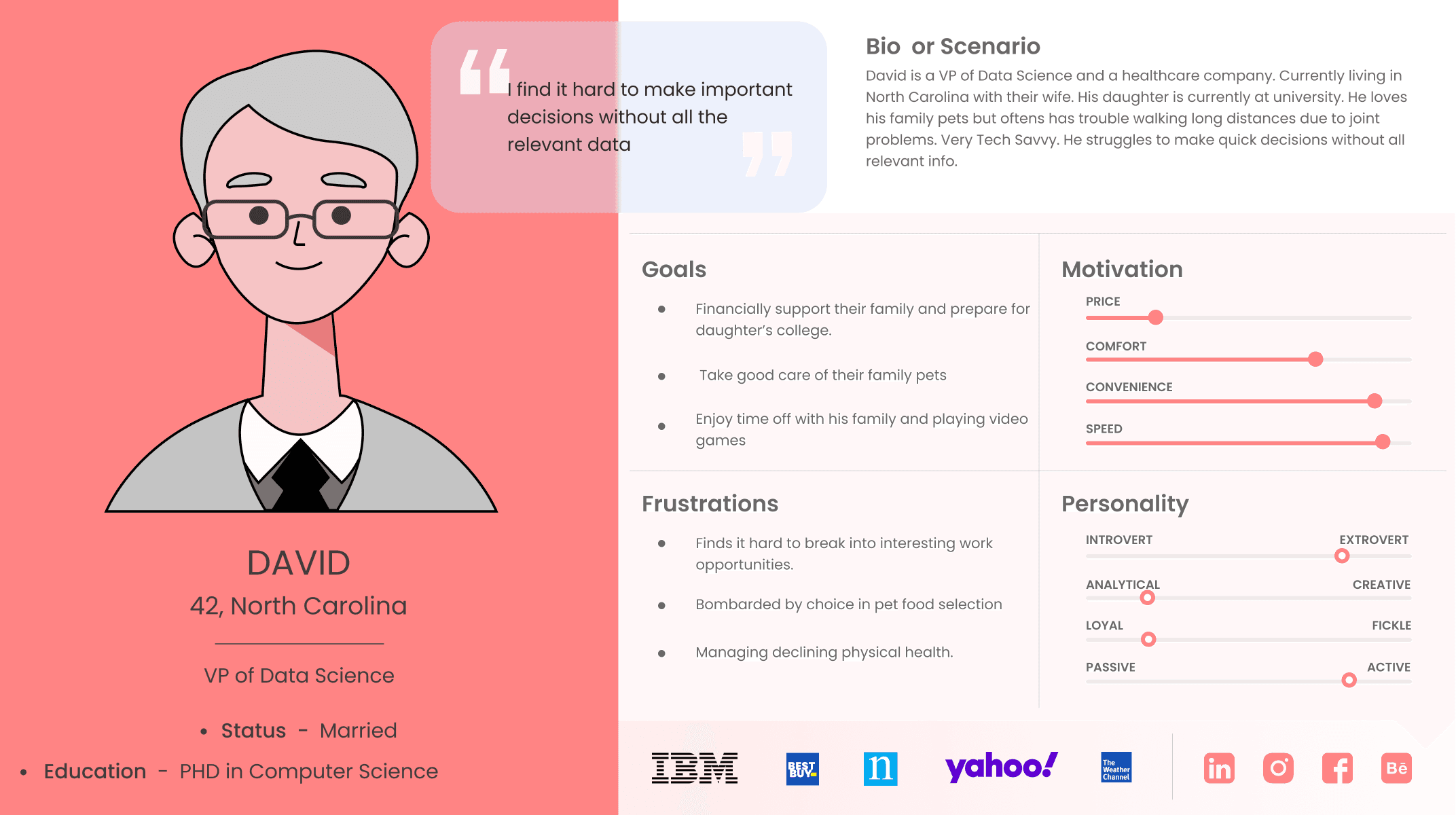
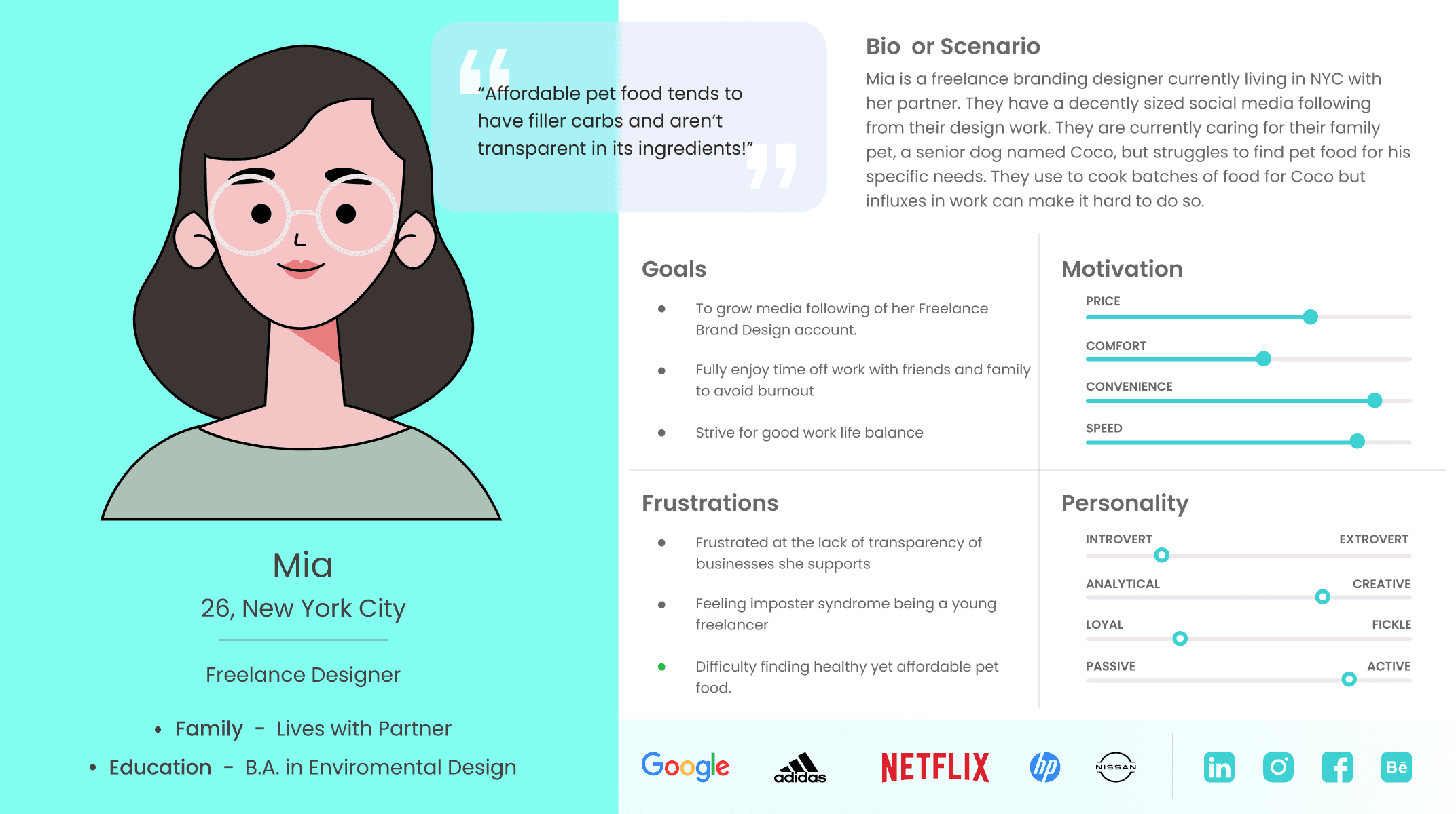
Meet Mia and David Jane
We wanted to form a deeper understanding of our users' goals, needs, experiences, and behaviors. We created 2 personas for each of our user segments. They were based on user interviews and surveys, and we kept updating them throughout the project as we gathered more data. We used these personas whenever we wanted to empathize with users and reconsider our initial ideas.
user journey
Whats the Roadblock?
With our personas in hand, we mapped out user journeys to see where we could identify points of friction and capitalize on opportunities. By doing this we discovered that...
💬
The main points of friction occur during choice comparison and order placement.
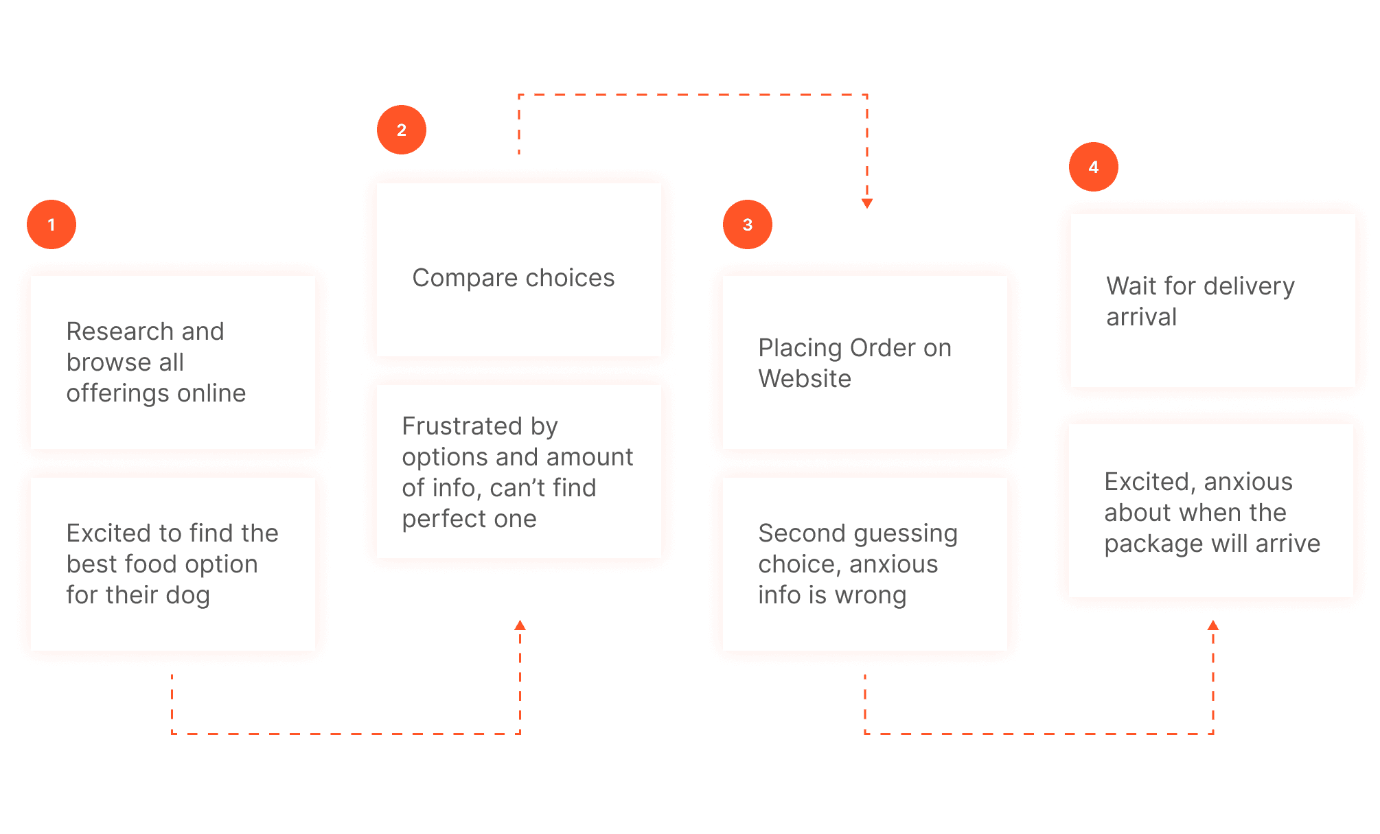
User Journey
competitive analysis
Sizing up the Competition
We compared the sign-up and purchasing experience of 4 competitors' products and reviewed customer sentiments to see where gaps and opportunities lie in the market.
Oppurtunities
Offer more customization with different options and pricing
Integrate a more seamless user flow
More elaboration on the delivery schedule/ structure
ideate
Creating a More Seamless Experience
After ideating, we realized we could circumvent the frustrations of ingredient comparison and placing orders by transforming them into a personalized survey.
The survey guides the user towards a personalized plan through an intuitive dialogue format, reducing cognitive load and streamlining the purchasing experience.
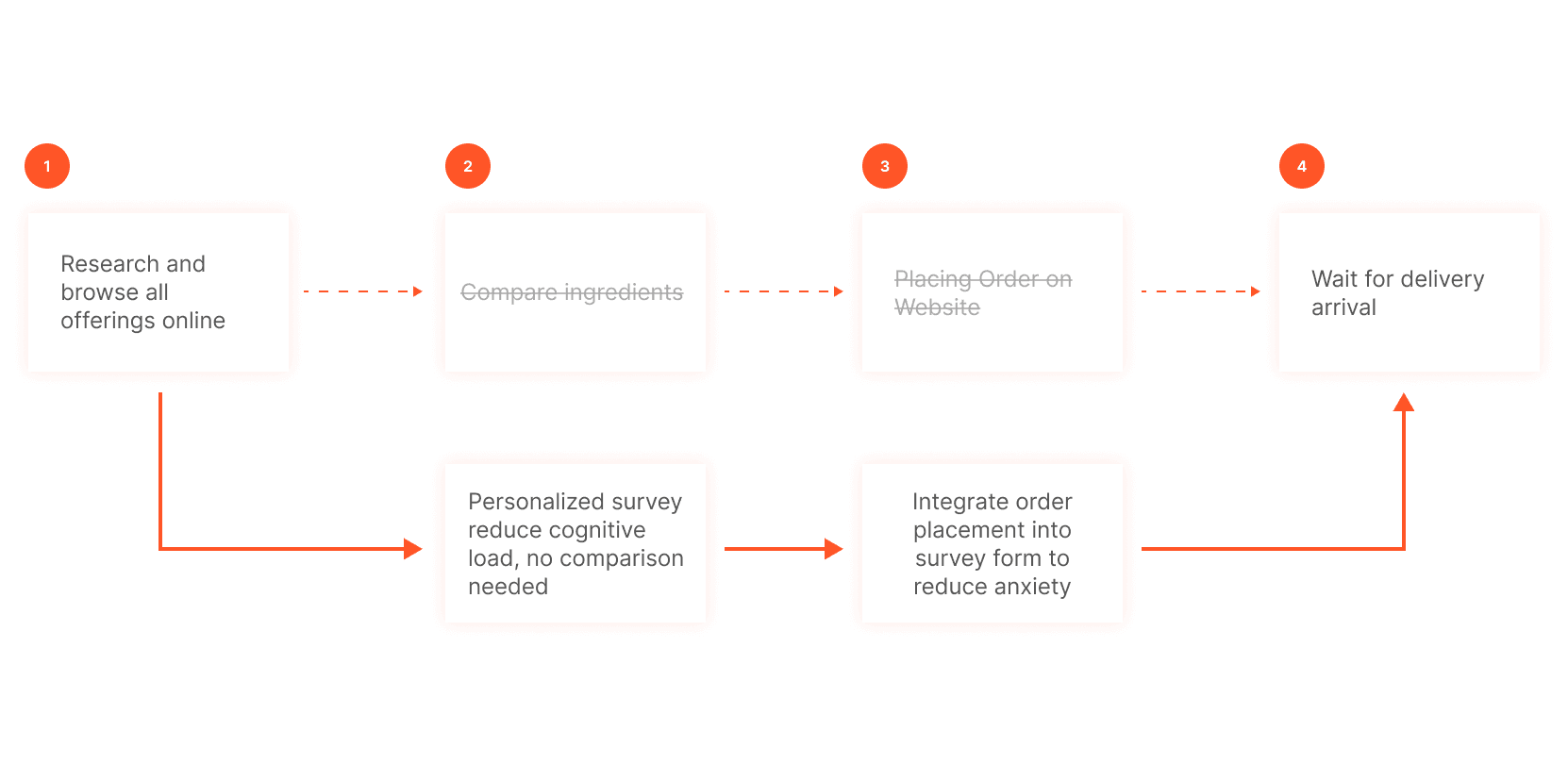
Revised User Journey
wireframes
Lo-Fi Designs
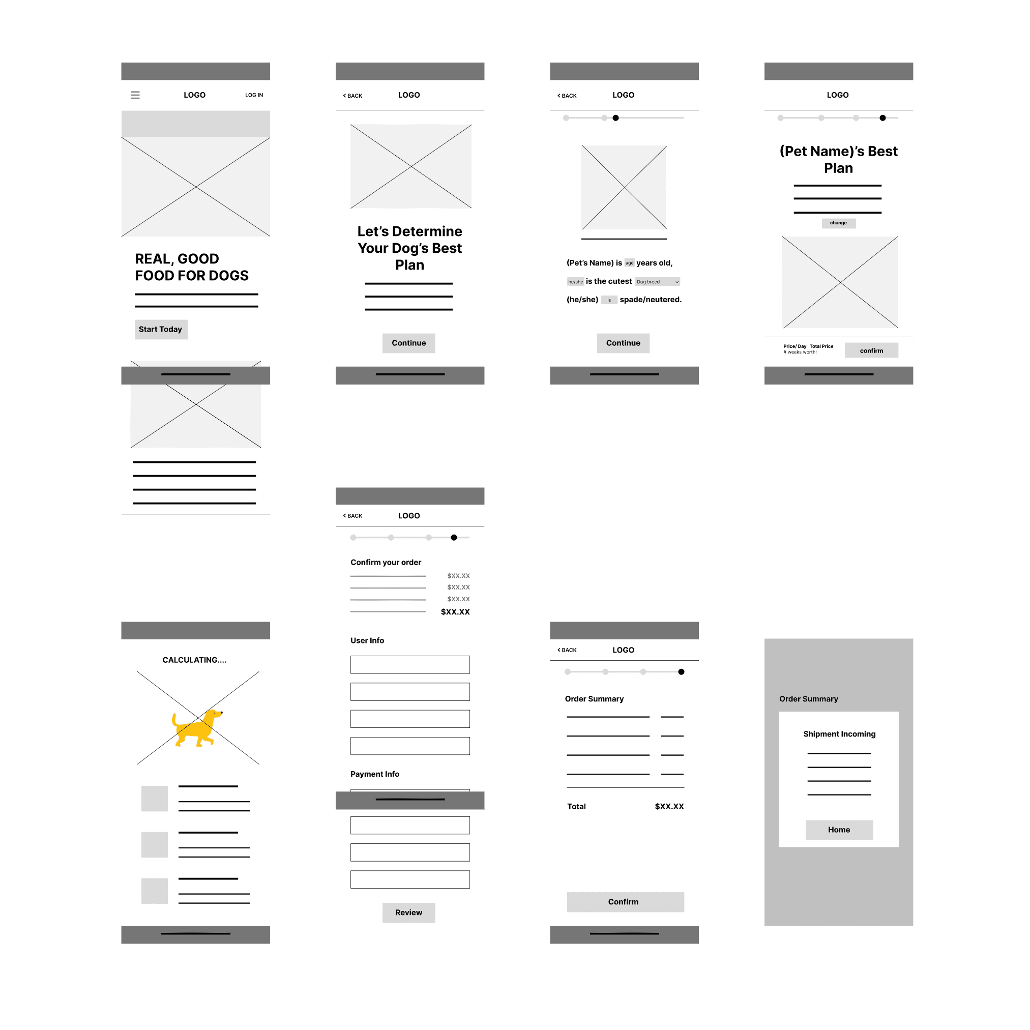
Using Figma, I created low-fidelity wireframes. I focused on the primary user flow to sign up and check out our trial plan from the home page.
usability testing
What the Users Said
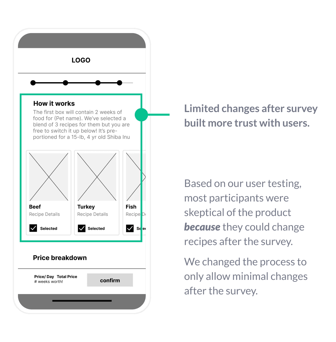
We want to test the usability of our mobile website, test if users can complete core tasks in the prototype, and determine edge cases/preferred user flow. We conducted virtual moderate studies with 5 individuals in our target demographic and synthesized results using affinity mapping.
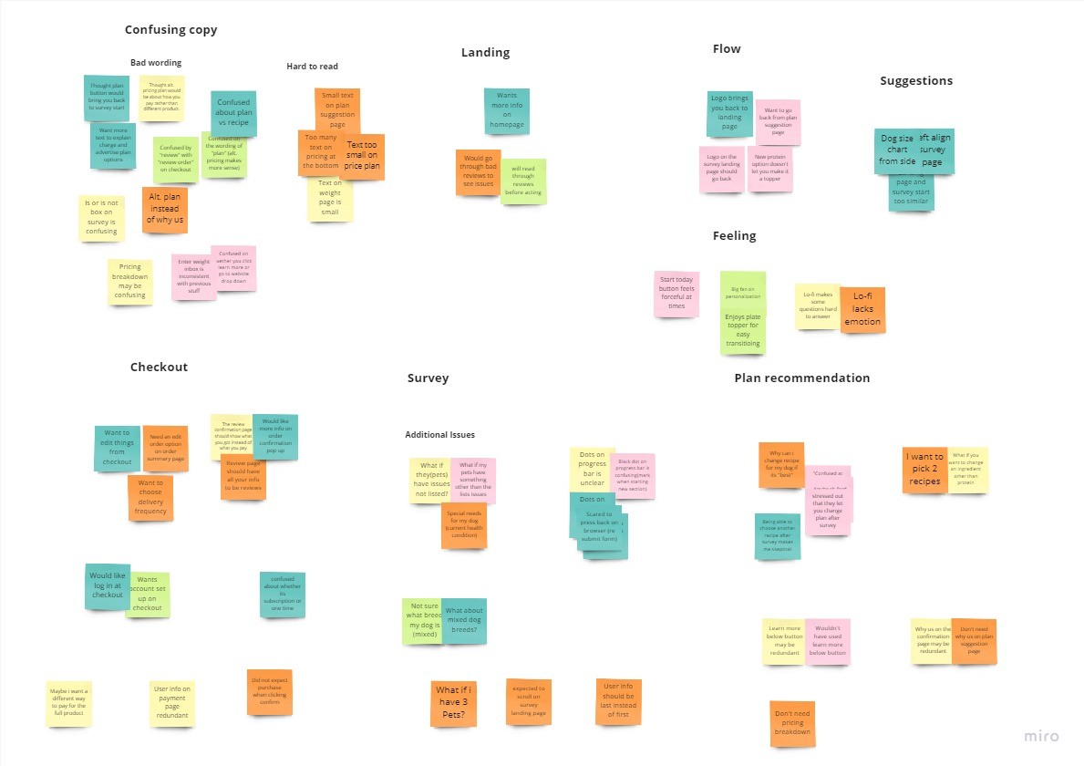
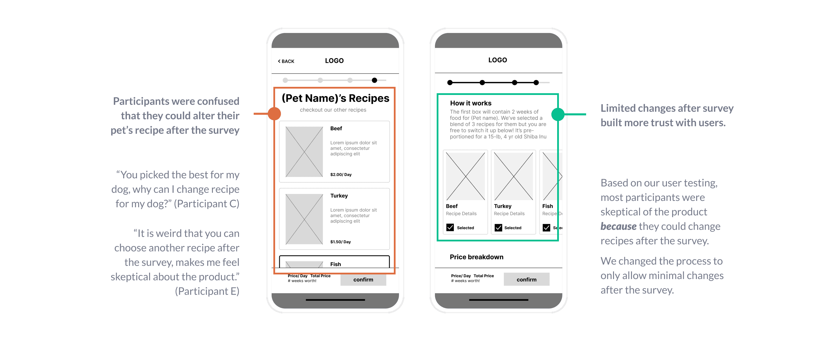
Round 1 Findings:
Lack of info upon confirmation
Users were cinfused by the progress bar and navigation
Users trusted our recommended plan and did NOT want to alter it
Round 2 Findings:
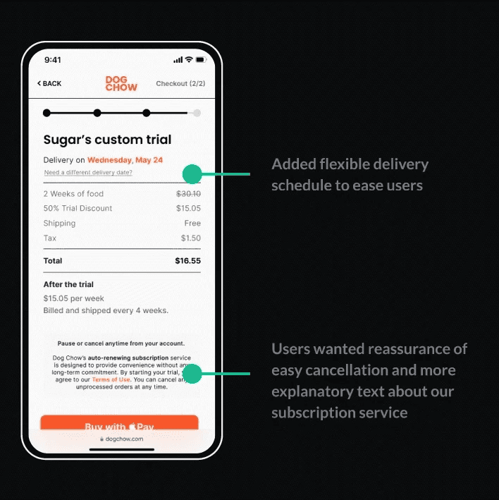
Users needed adjustable deliveries.
Lacked user flow for owners with multiple dogs
Feeding instructions were unclear.
going forward
Next Steps
01
Create a fully responsive website for all devices to fully flesh out the design.
02
Conduct more user research to determine if we’ve fulfilled our niche fully.
03
Conduct another round of usability studies to validate whether user pain points have been addressed.
Learnings?
I learned so much, from emphasizing with the user to creating, prototyping, and testing designs. Having real data to validate each choice made the design more usable. Competitive analysis is a great tool when lacking user data or experience!
