Cognify
Science-backed digital flashcard web app.
Web App
Responsive
Personal Project
Education
UX
ROLE
Just Me!
Product Designer
PLATFORM
Web App, Responsive Design
TOOLS USED
Figma, FigJam, Google Forms, Google Meets, Miro, Adobe Suite
DURATION
July 2023 - September 2023
(8 Weeks | 80 Hours Total)
OVERVIEW
What is Cognify?
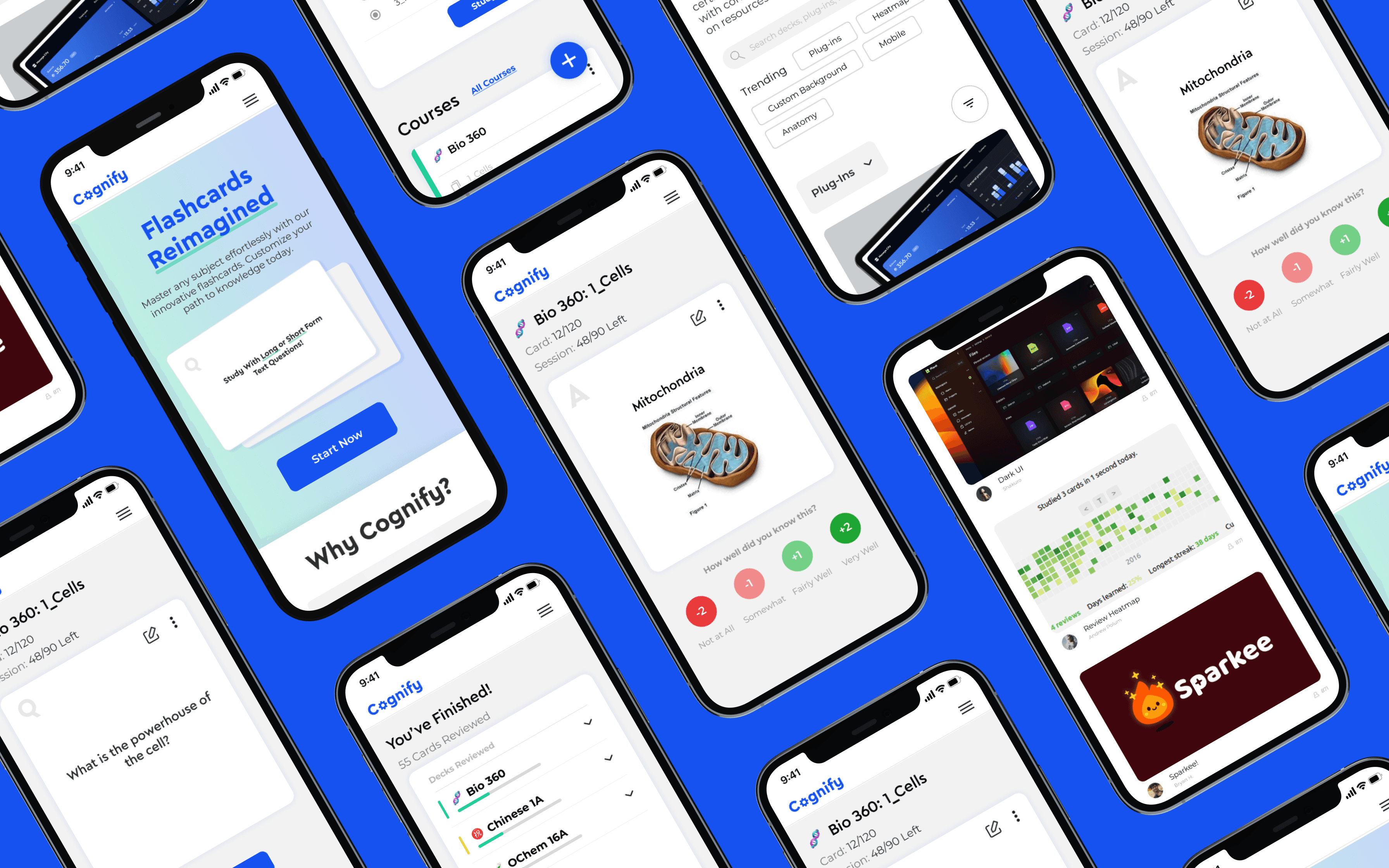
A digital flashcard web app that utilizes a spatial repetition learning algorithm to improve long-term memorization of complex information. It was done as a personal project as part of my UX course work.
Problem
Traditional flashcard tools focus on short-term memory retention without spaced repetition or lack the flexibility to cater to all user needs.
Goal
To provide a product focusing on long-term memory retention with adaptability and customization.
SOLUTION #1
Onboarding Tutorial
Our goal was to create a succinct and user-friendly guide, focusing on getting users started with essential features. We chose to postpone the introduction of complex functions to prevent overwhelming our users.
SOLUTION #2
Spatial Repetition Learning Algorithm
A proven scientific method for long-term memory retention. Users rank cards after answering to ensure they are only shown cards they struggle with. Users are "prescribed" cards to review each day.
SOLUTION #3
Community
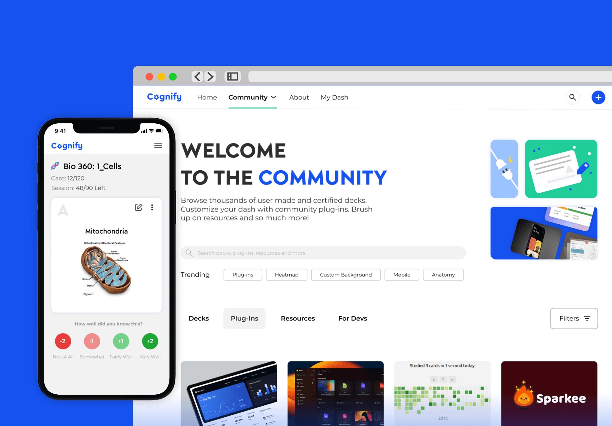
Diverse users mean diverse user needs. We wanted to maintain flexibility and endless customizations through Cognify Community, where users can share resources, plug-ins, decks, and more!
SOLUTION #4
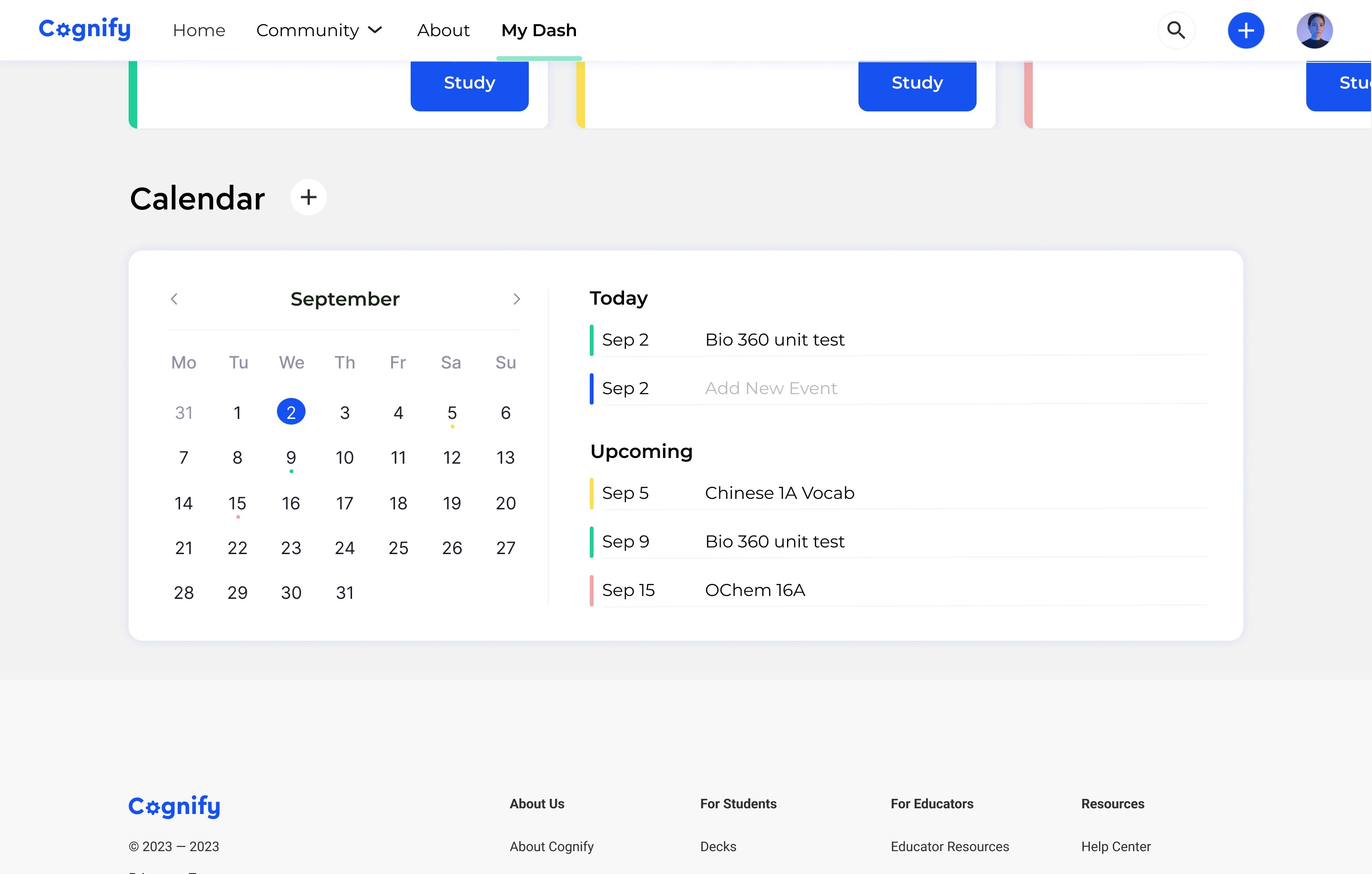
Calendar
Adding exams and other events to the calendar helps users manage time better! Exams and events change the prescriptive algorithm to better suit user needs.
The Design Process
User Research
Methodology
Conducted user interviews to build new personas and inform the design. Additionally, I collected surveys about user sentiment on competitor offerings. These findings were referenced throughout the entire design process.
Findings
The primary user group identified is college and post-grad students.
Users appreciated the structured nature provided by spaced repetition.
Some users wanted multiple customizations while others preferred a simpler experience.
Users were focused on efficiency and long-term memory retention.
pain points
What Frustrated the Users
1. Tedious Onboarding
Existing products’ onboarding experience is tedious and uninformative.
2. Lack of Adaptability
Existing products lack customization options to fit each user’s unique needs.
3. Recognition vs Memorization
Users want to truly comprehend the content, rather than memorizing through pattern recognition.
4. Time
Students struggle to manage study time, personal life, and exam schedules.
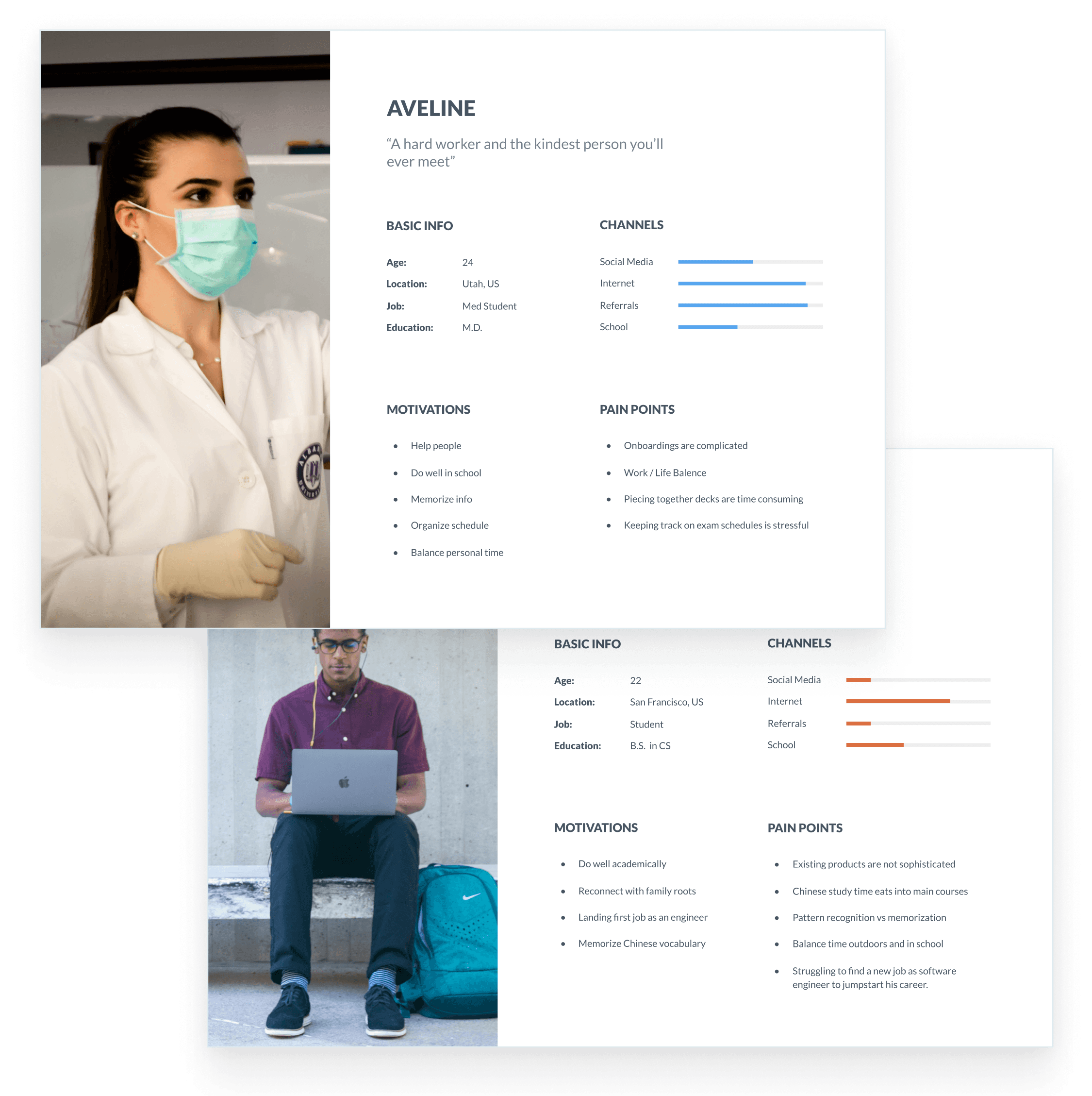
USER PERSONA
Meet Aveline and Leo
We wanted to form a deeper understanding of our users' goals, needs, experiences, and behaviors. We created 2 personas for each of our user segments.
competitive analysis
Sizing up the Competition
We compared the experience and product offerings of 4 competitors to see where gaps and opportunities lie in the market.
Oppurtunities
Ideate
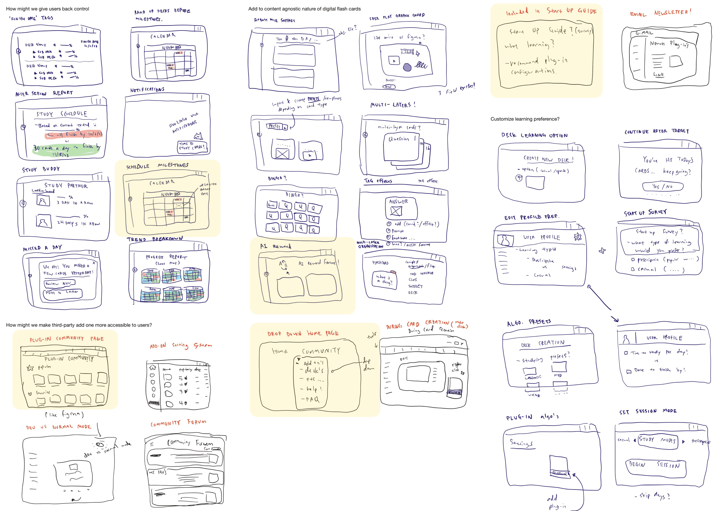
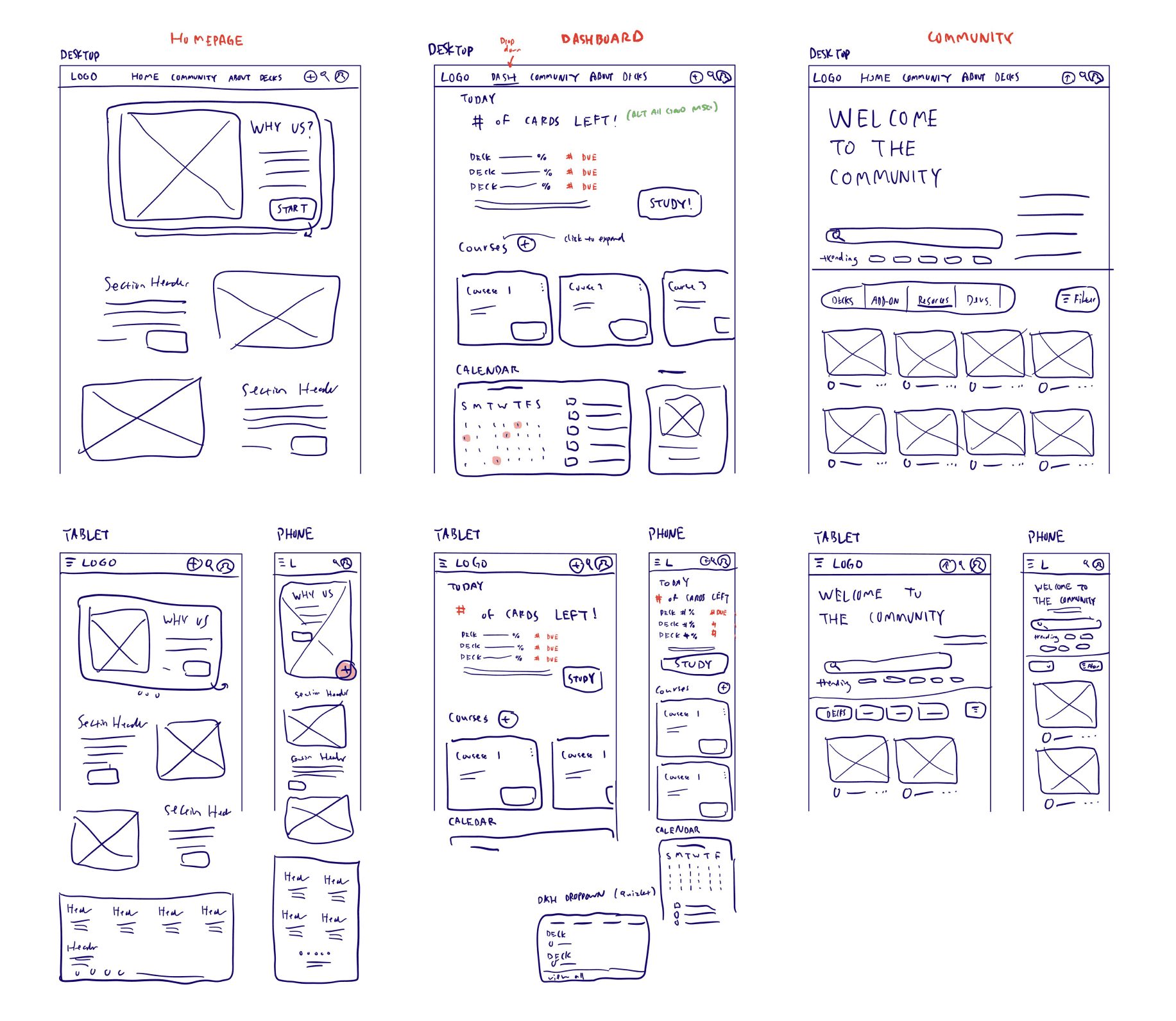
Sketches
Rapidly iterating on user pain points allowed us to generate innovative ideas on how to solve them! Ideas were then added and tested with user feedback.
Potential Solutions:
Calendar feature
Community page
Organization strategies
AI reword feature
Onboarding tutorial
Crazy 8
wireframes
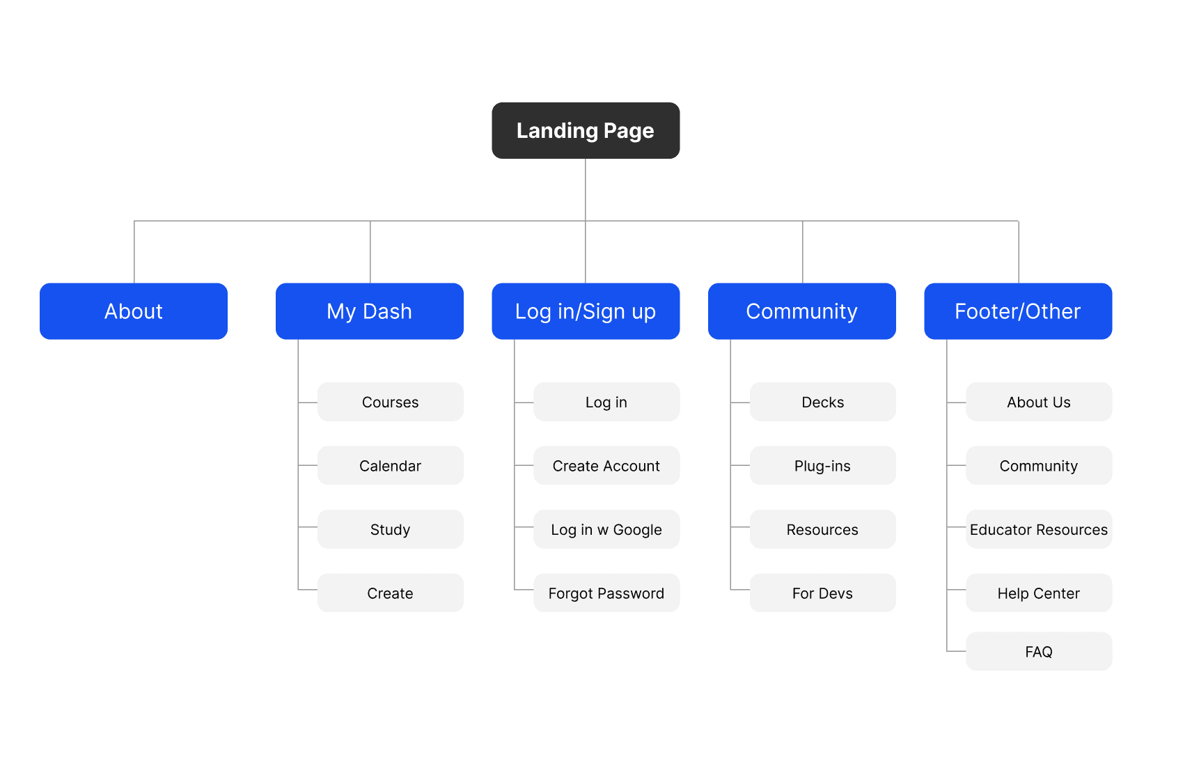
Site Planning
We used a conventional sitemap to ensure easy navigation. However, we also added a new Community page as a hub of information and exchange for our users.
wireframes
Responsive Design
Users reported studying at various times, in bed, at the gym, and during commutes. We wanted to implement responsive design at an early stage to make sure our product is compatible with all screen sizes.
wireframes
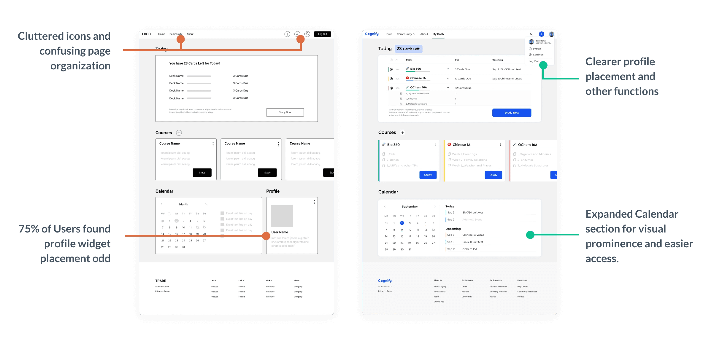
Usability Testing
We wanted to test the usability of our main user flows to see if users could complete core tasks in the prototype, and if any pain points arose.
We conducted 5 online moderate studies with our target demographic and synthesized results using affinity mapping.
Findings
Lack of study options.
Main navigation through the plus button.
Users found profile placement odd.
Low Fidelity Prototype
"Loads better than Anki and other apps I've tried, wish you'd make it real"
— Aveline, Med Studet
going forward
Next Steps
01
Flesh out further user flows such as creating new decks and organizing decks.
02
Test designs on more users to collect more data about the user experience.


